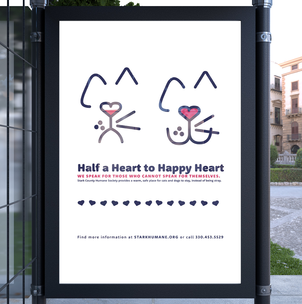
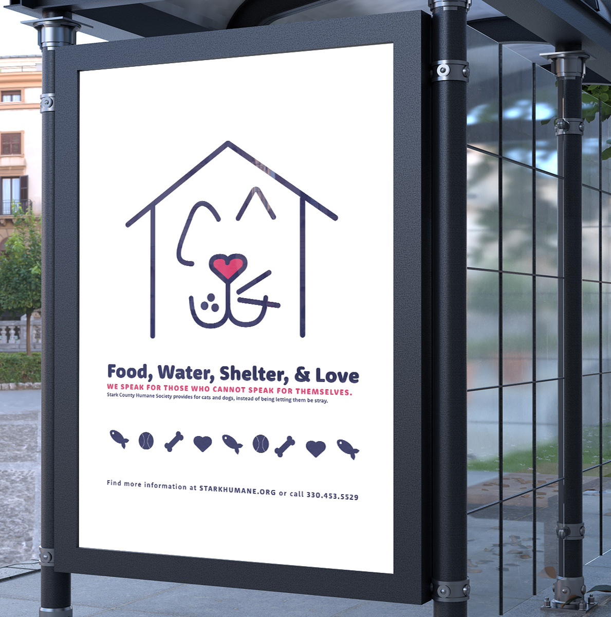
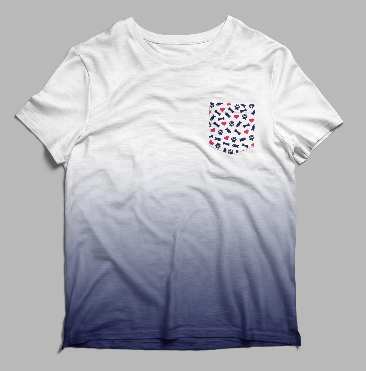
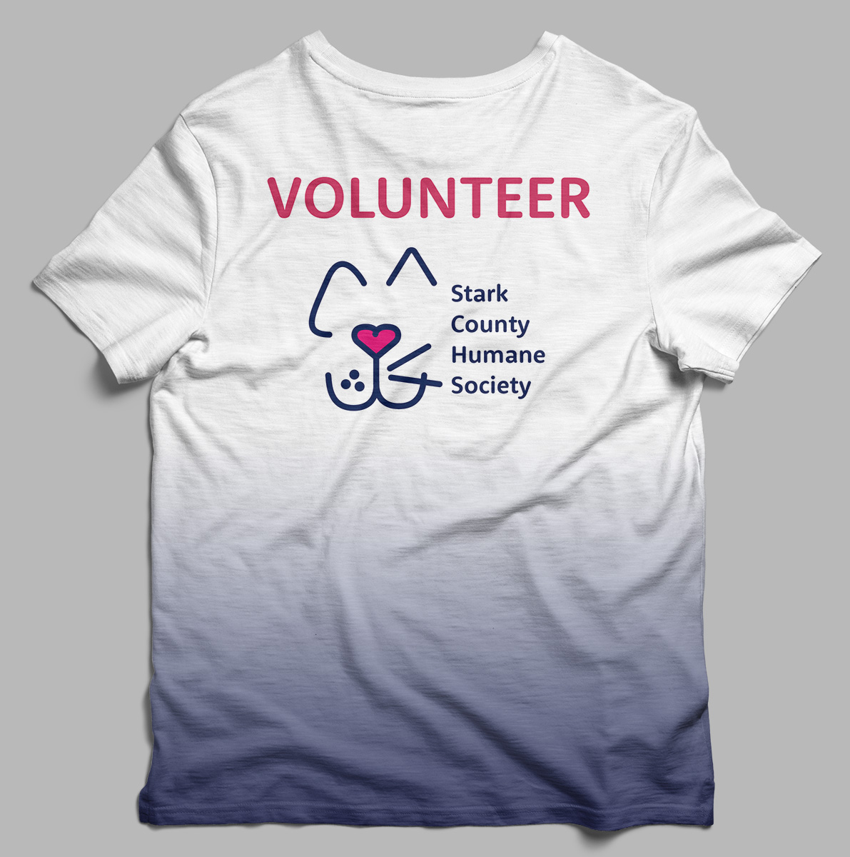
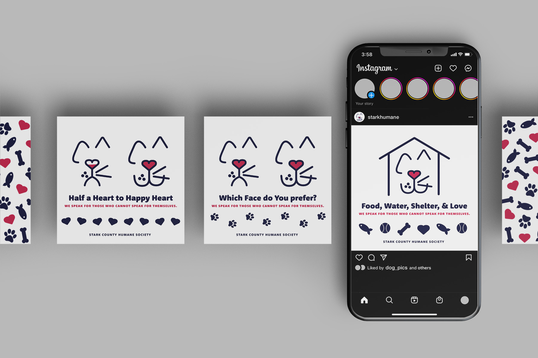
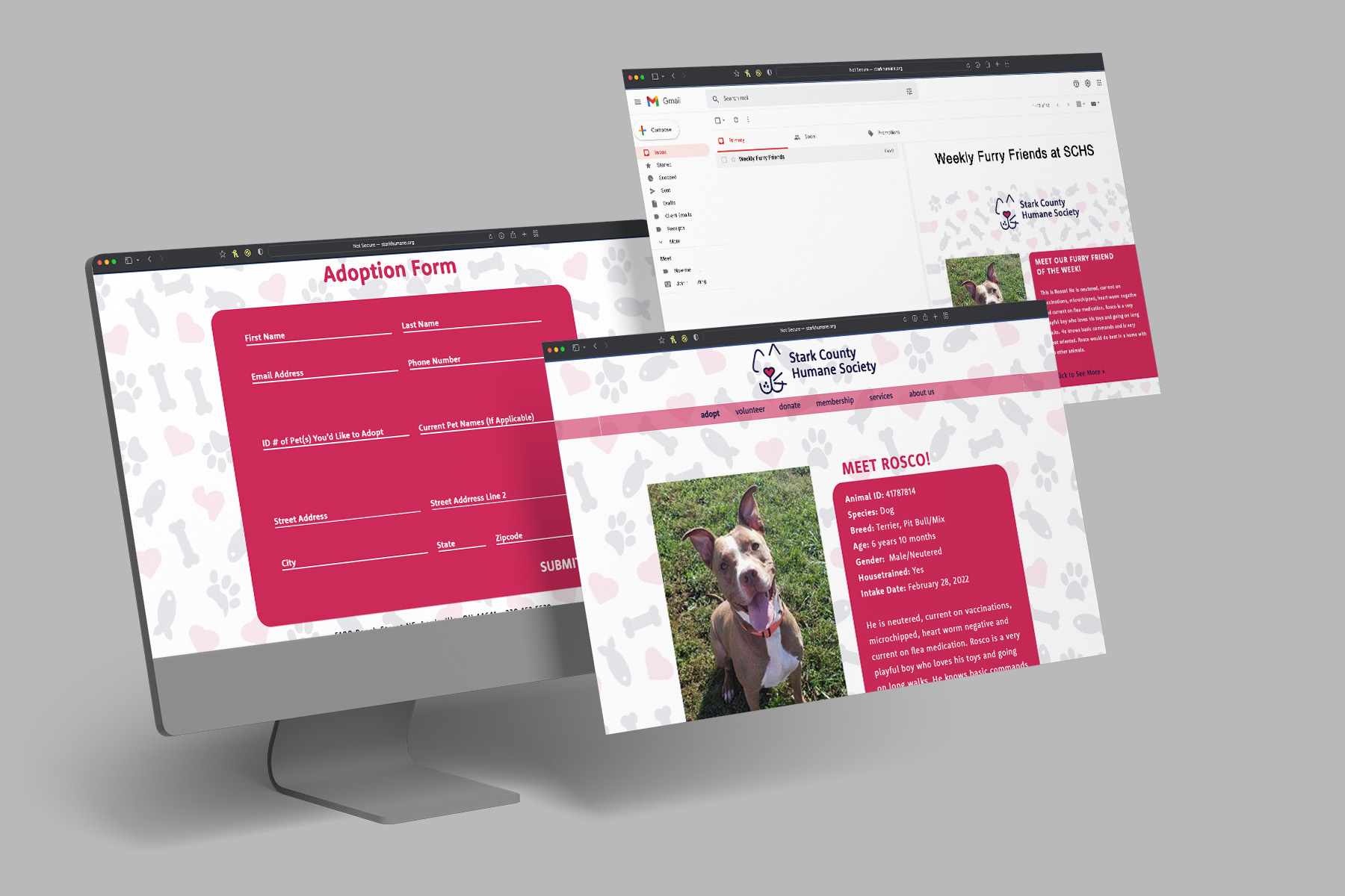
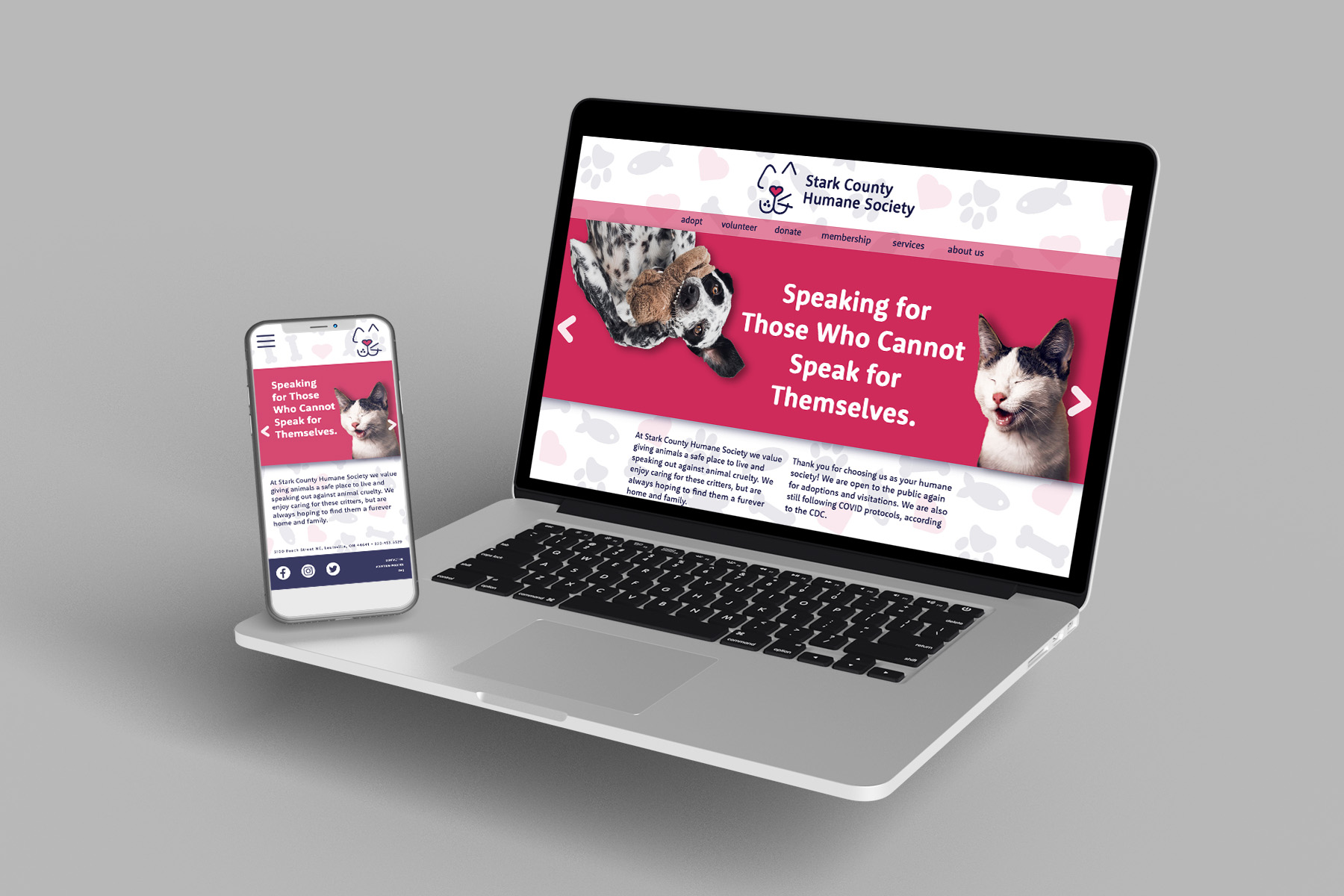
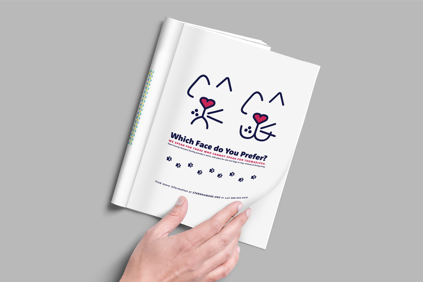
Stark County Humane Society Rebrand
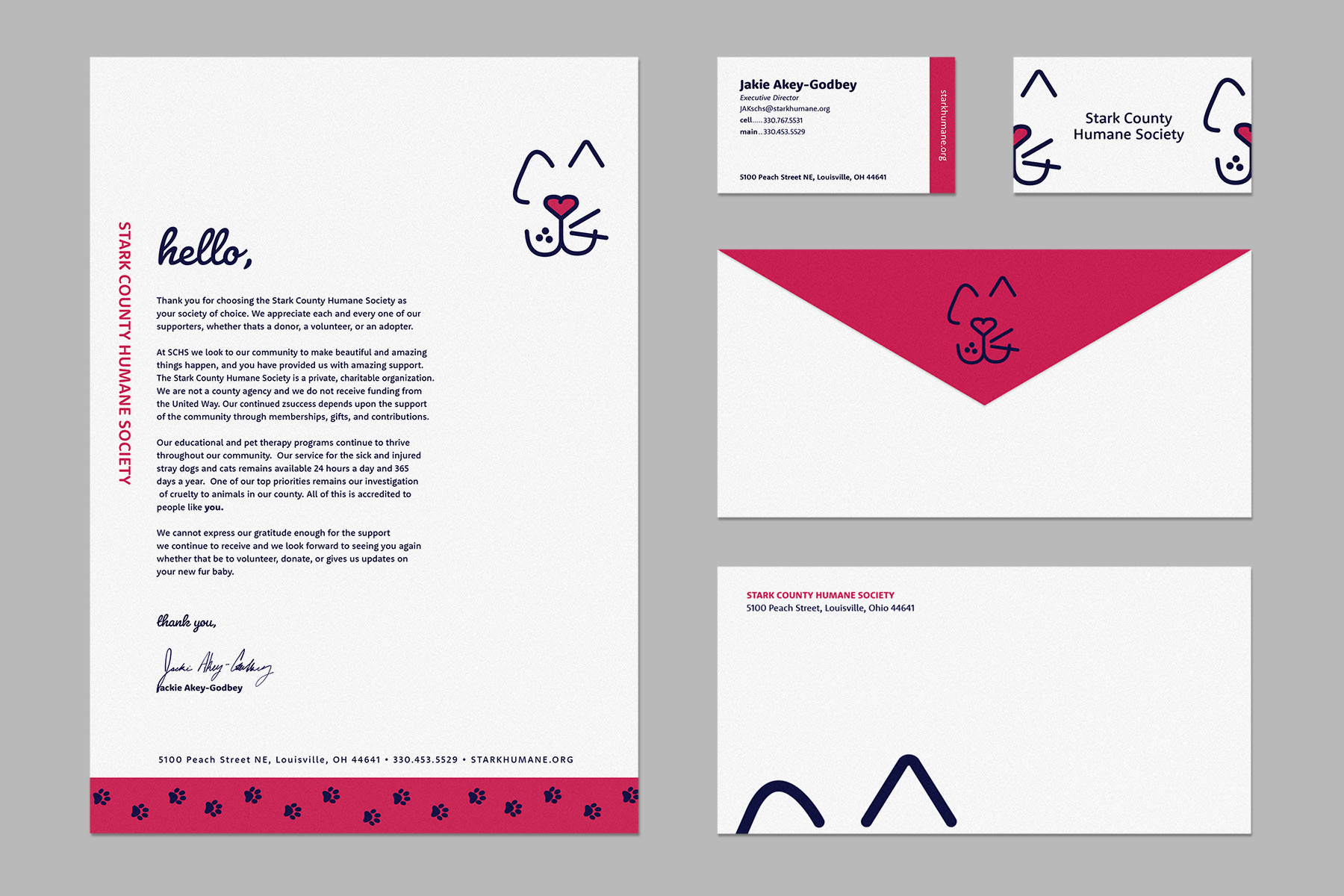
Brand Identity | Stark County Humane Society
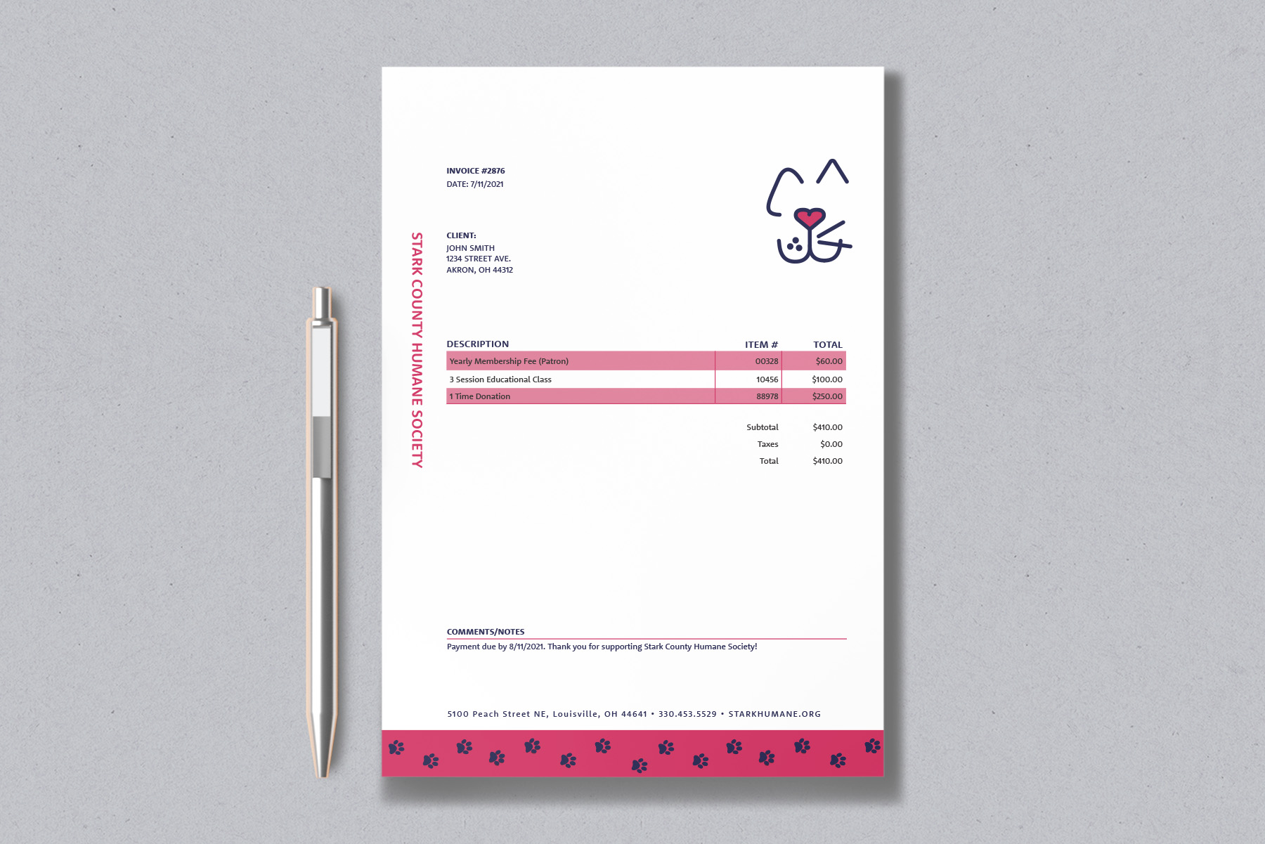
Project: Stark County Humane Society Brand Identity
Class: Corporate ID
Professor: Brittyn Dewerth
Date: Fall 2021
Deliverables:
Class: Corporate ID
Professor: Brittyn Dewerth
Date: Fall 2021
Deliverables:
- Redesigned Logo
- Letterhead
- Business Card
- Envelope
- Invoice
- Web Home & Interior Page for Desktop & Mobile
- HTML Email & Landing Page
- Ad Campaign Series for Print & Social Media
- Minimum of 3 Extra Build Out Items
- Brand Guide
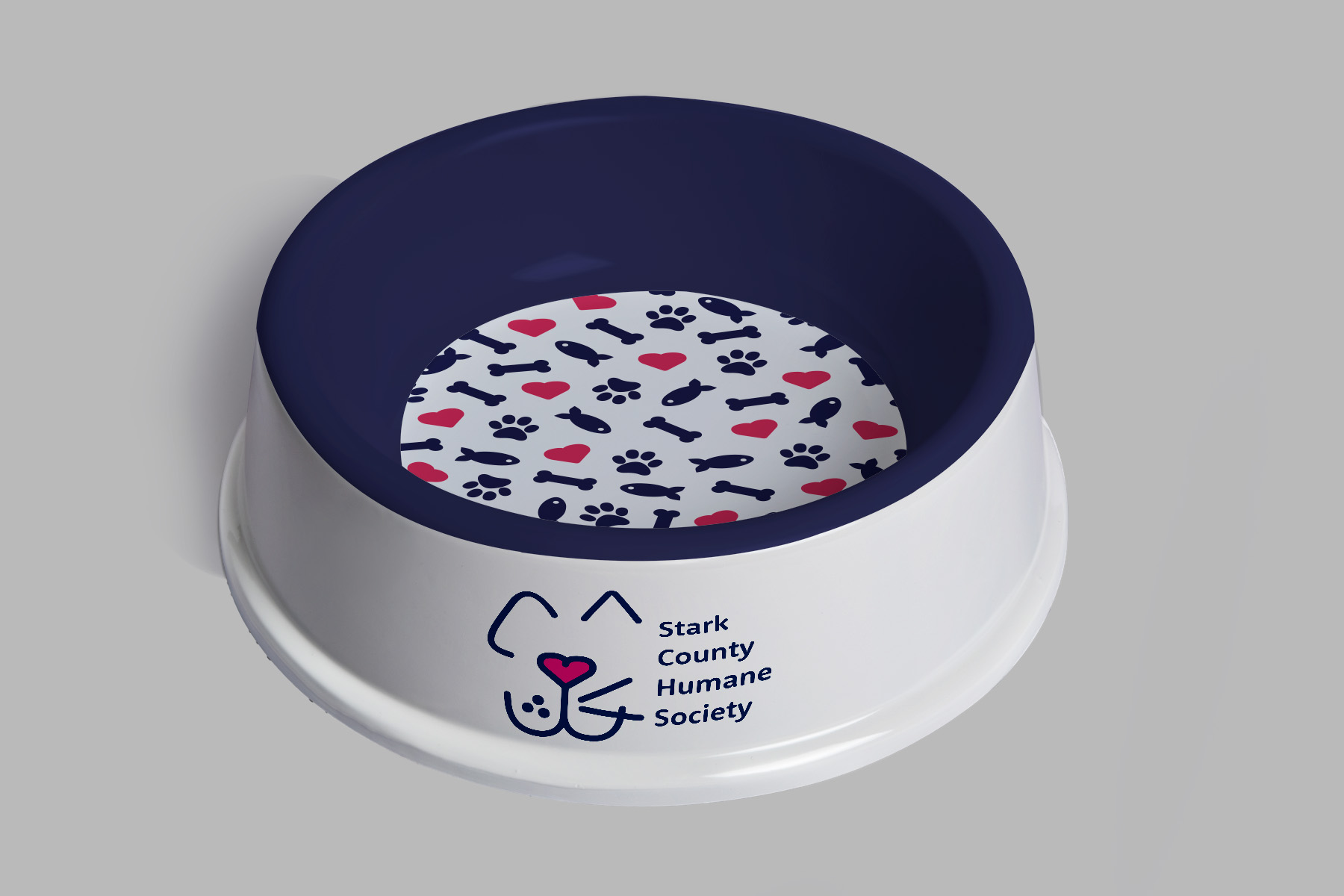
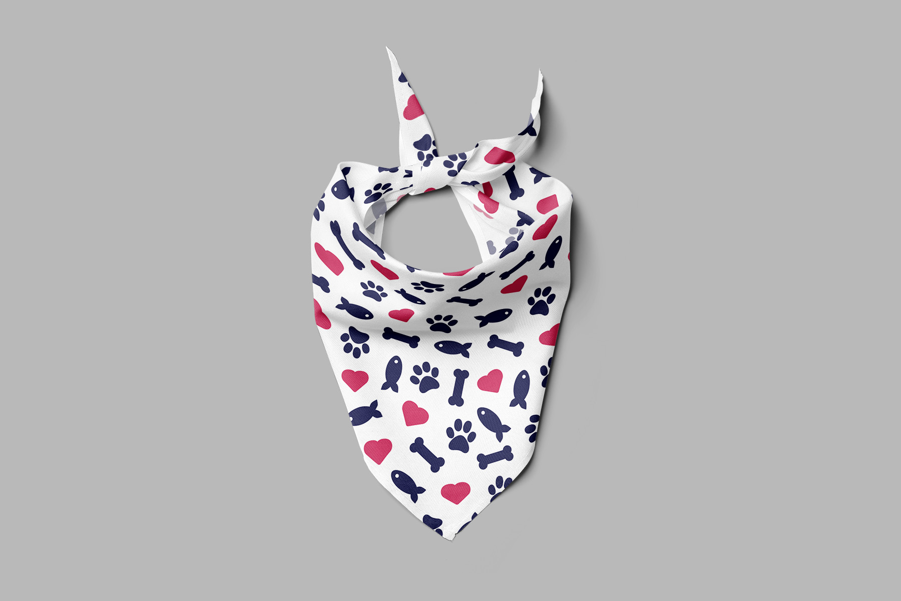
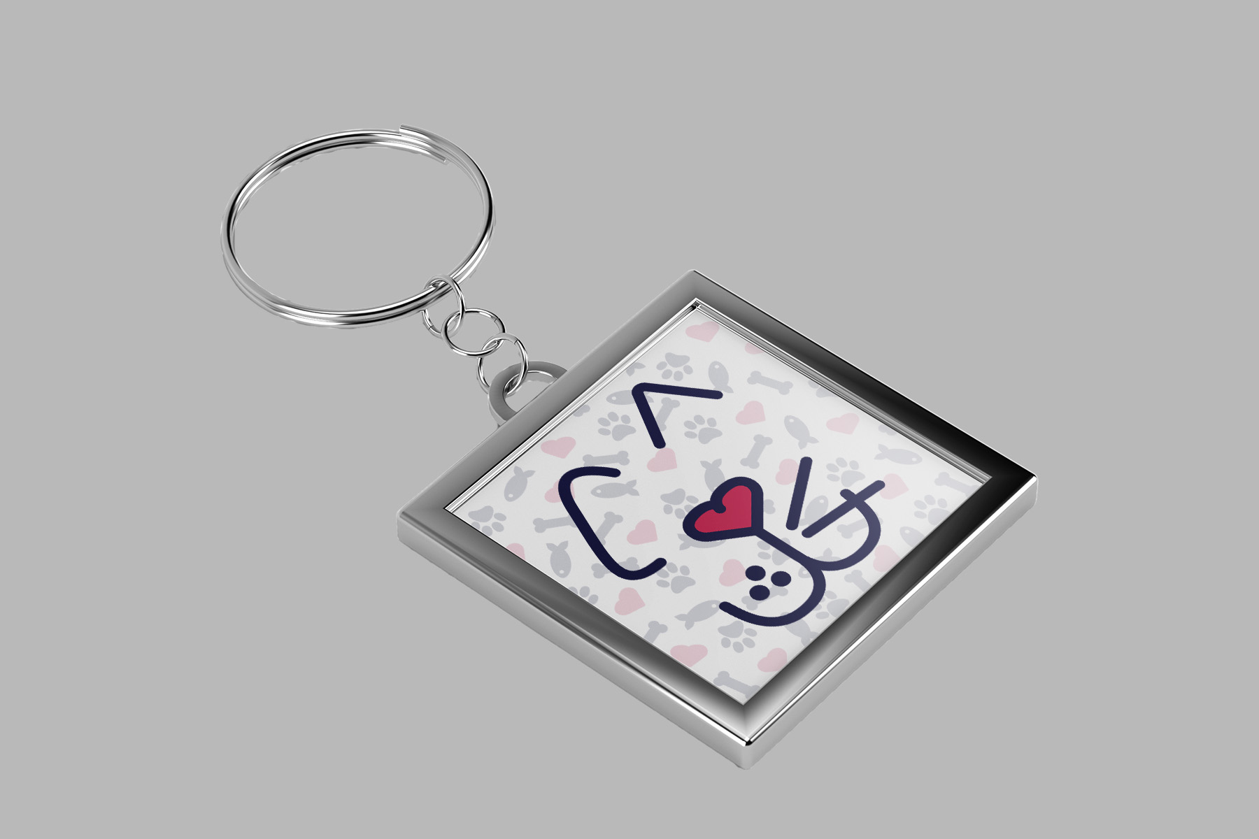
Description: Stark County Humane Society is a non-profit that shelters cats & dogs. By using modern but friendly elements, SCHS is brought to life and will encourage more donors, volunteers, and adopters to support them.
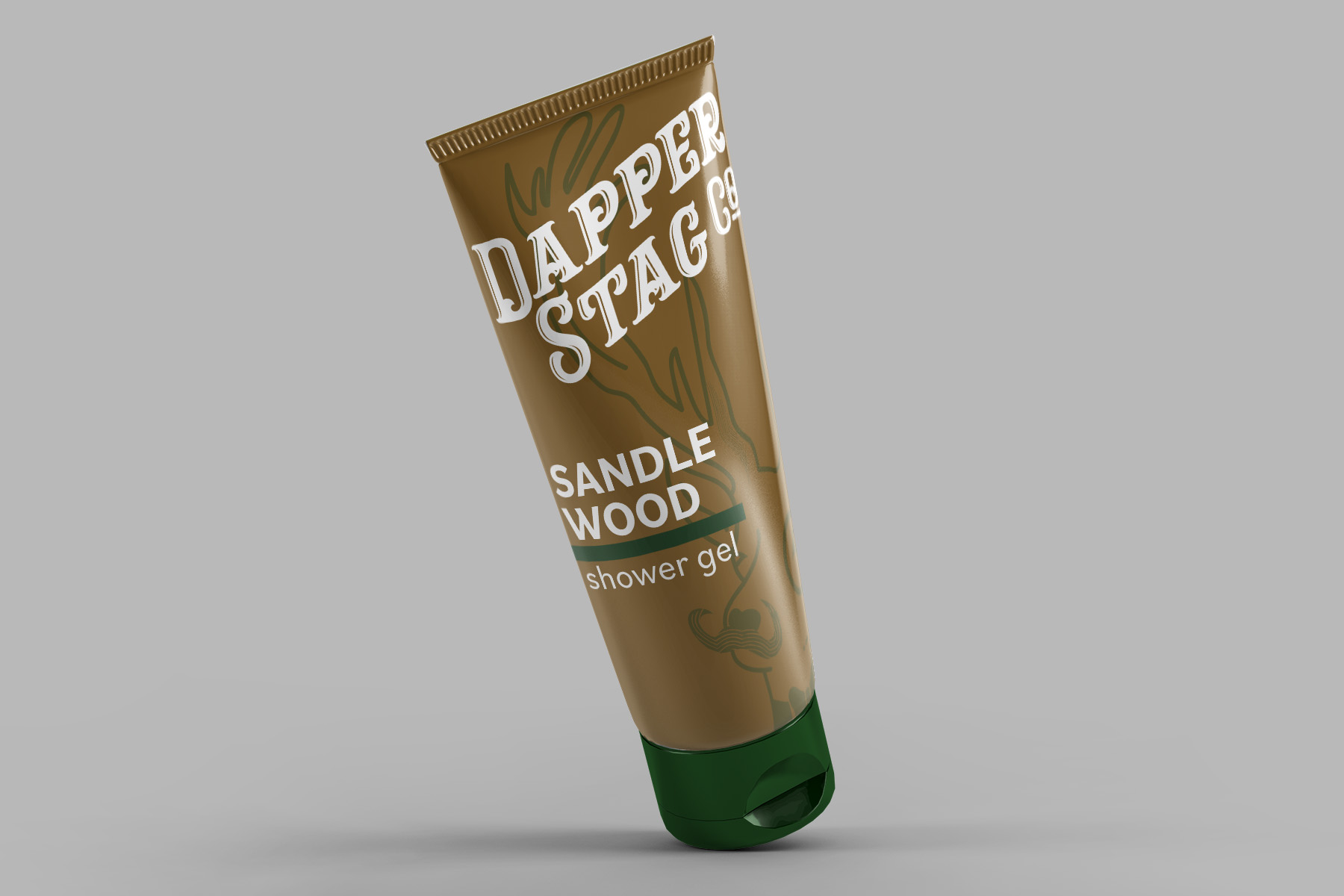
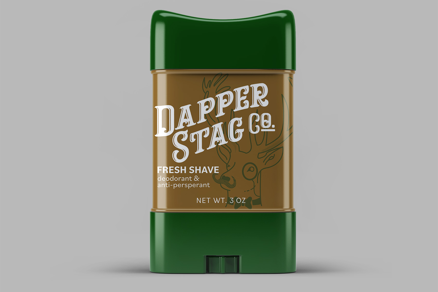
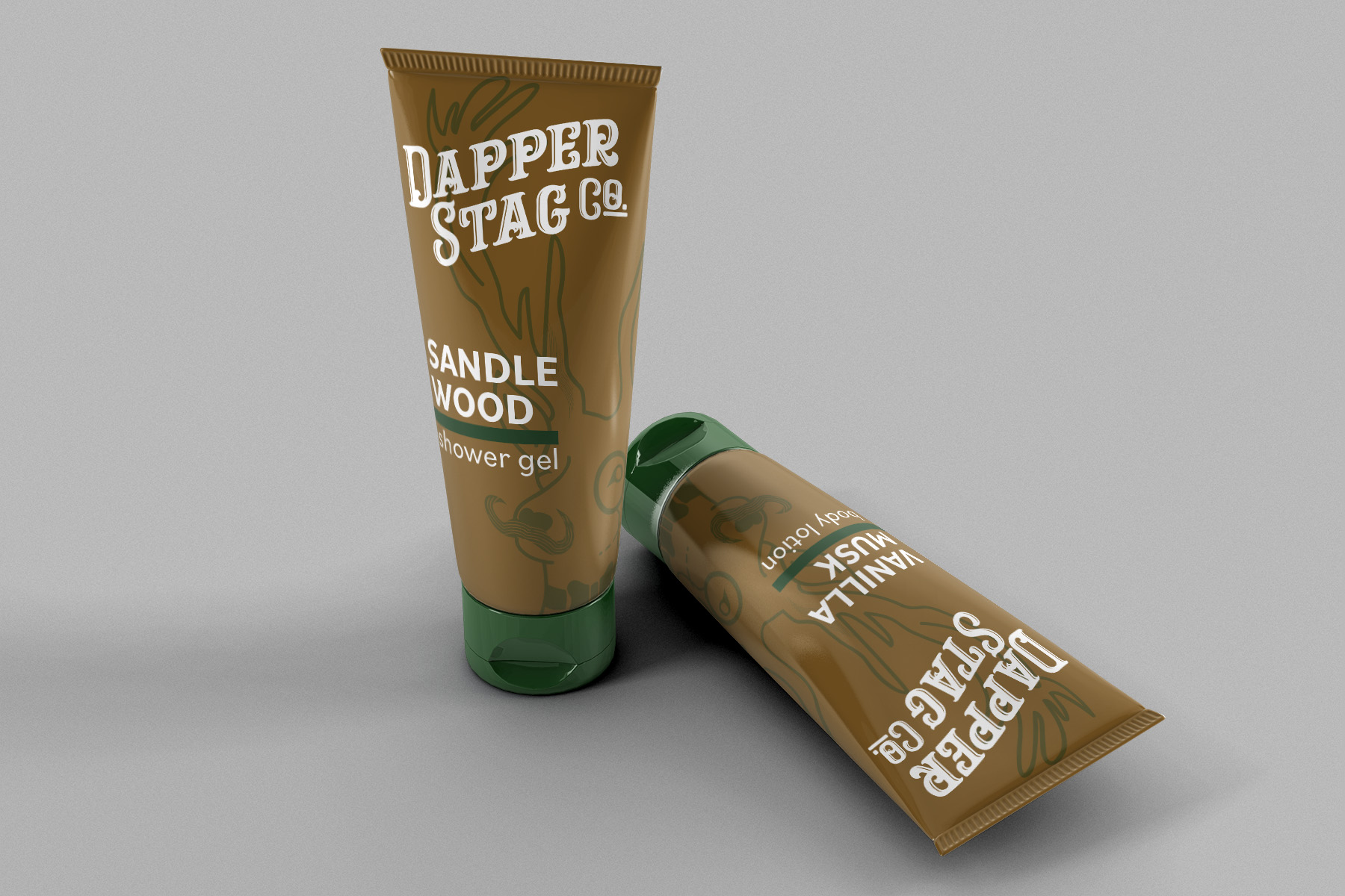
Dapper Stag
Diverse Forms Packaging | Dapper Stag Men’s Hygiene Line
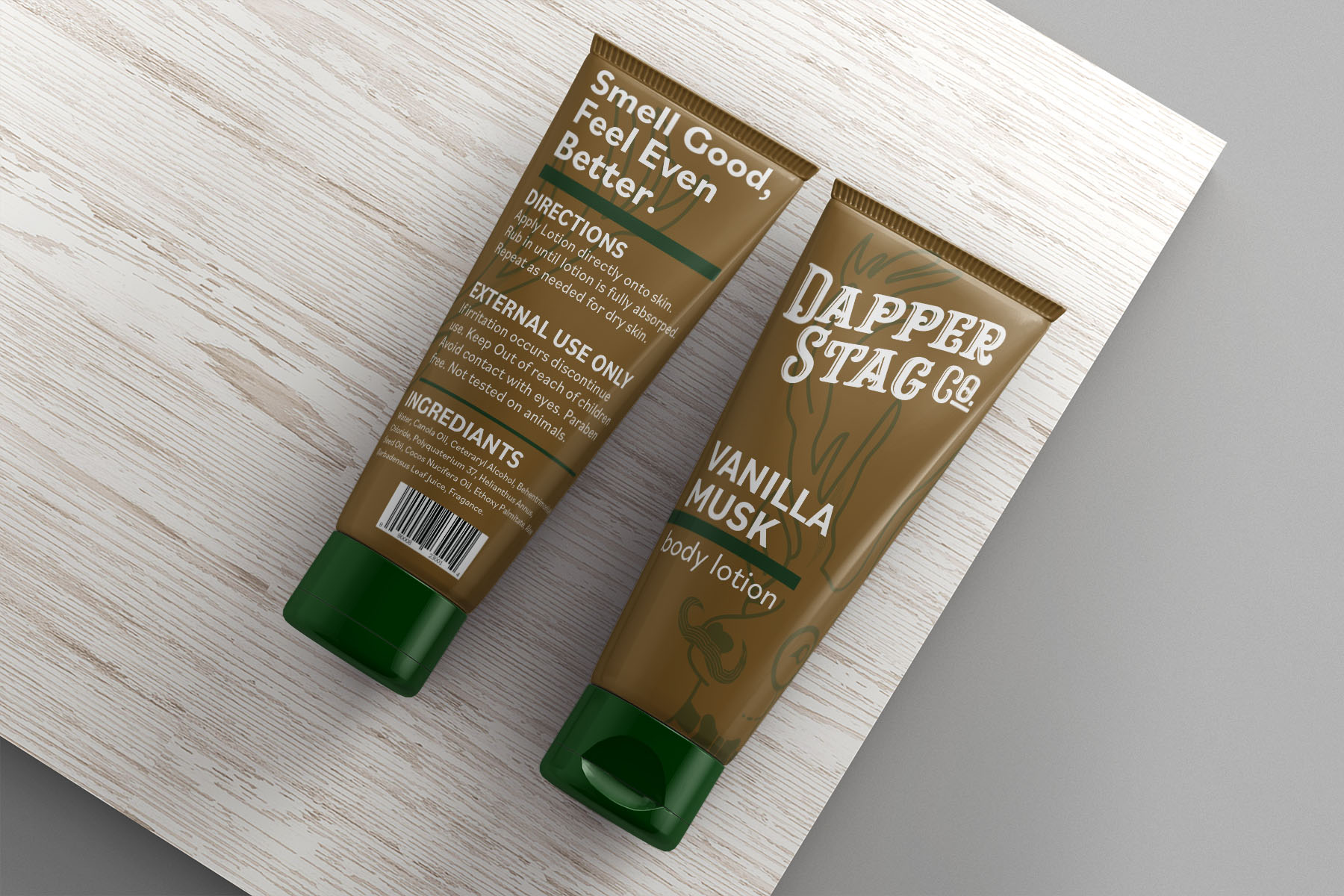
Project: Diverse Forms Packaging
Class: Packaging
Professor: John Morrison
Date: Fall 2021
Deliverables:
Class: Packaging
Professor: John Morrison
Date: Fall 2021
Deliverables:
- 3 Fully Designed Form Variations
- Mock Up Photos
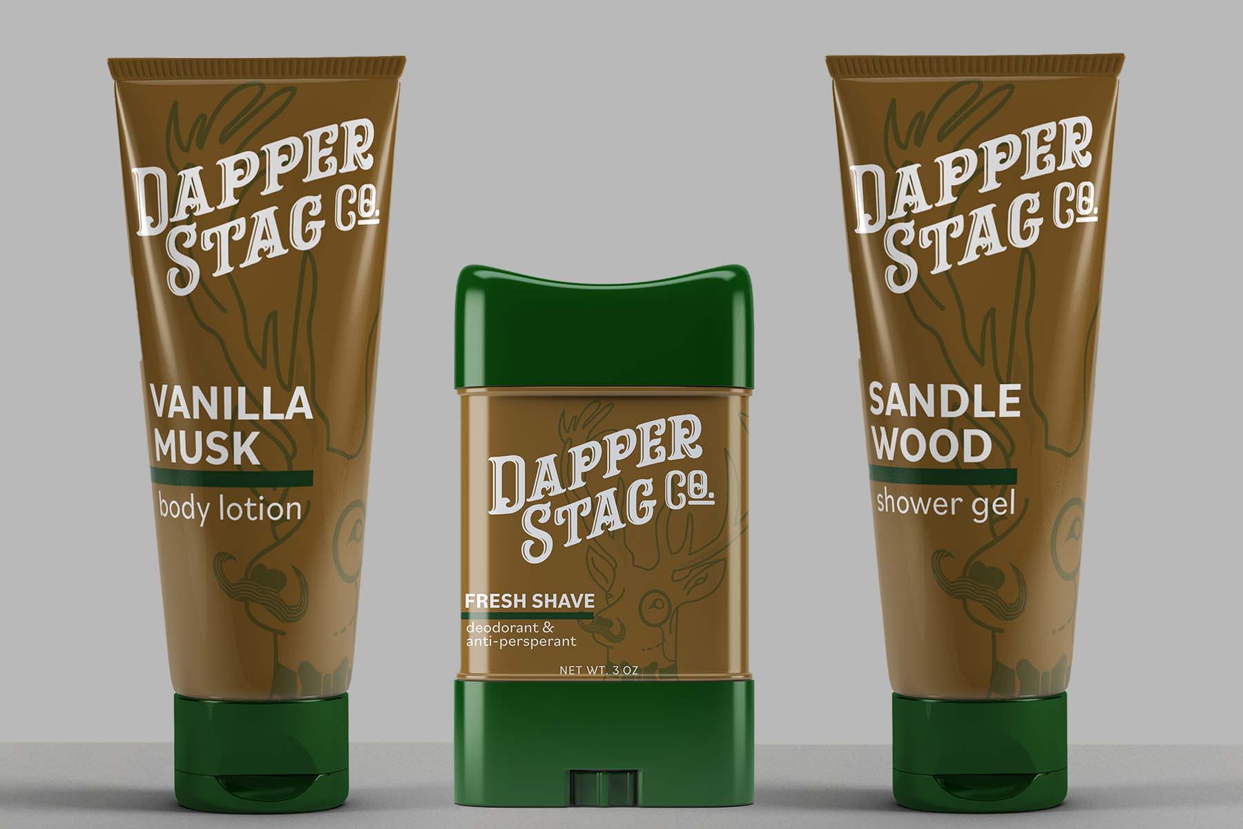
Description: Dapper Stag Co. uses a traditionally masculine approach using dark colors and a bold typeface. Pulling from antique logos, barbershops, and male-focused interior design for style and color.
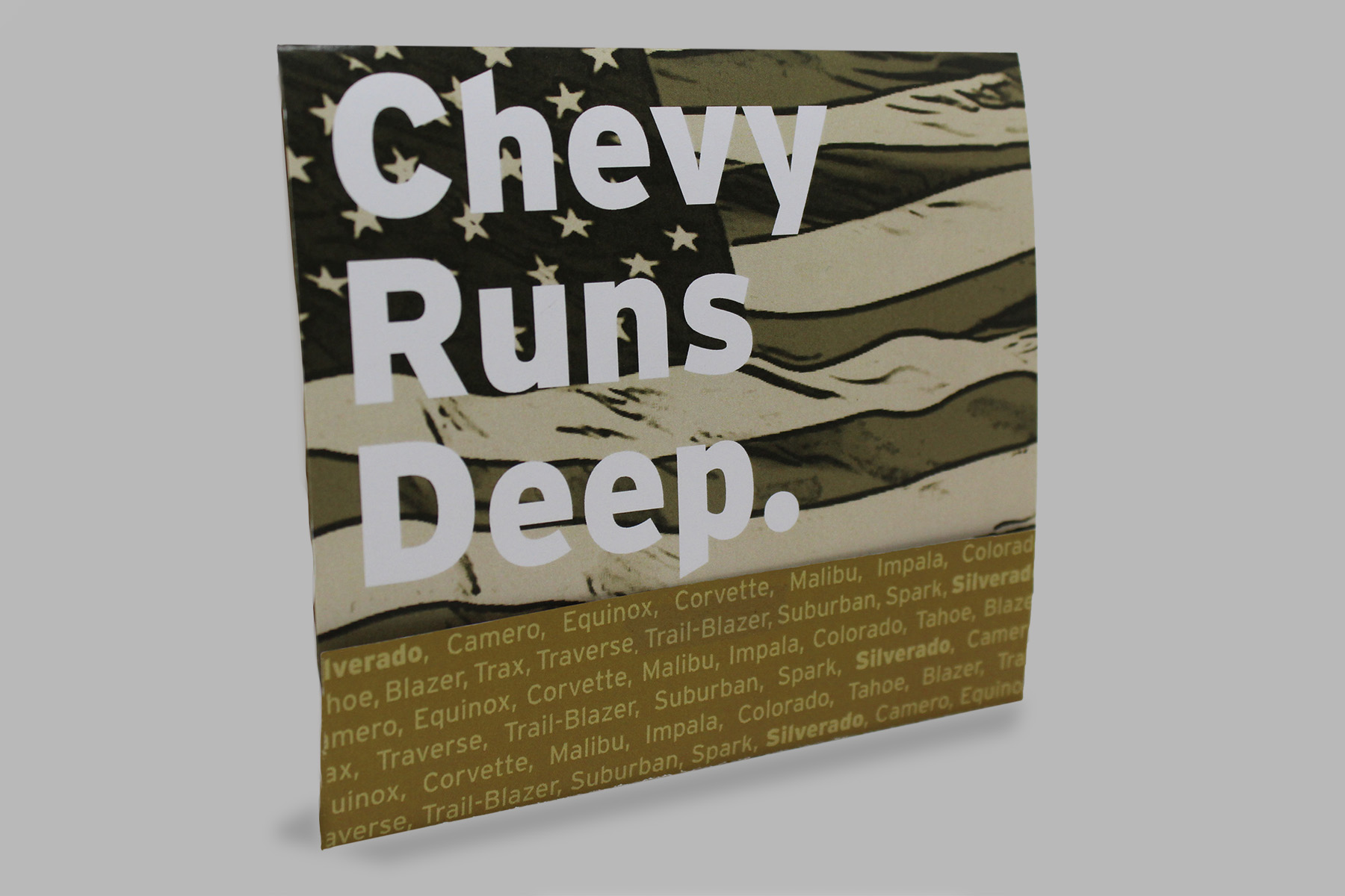
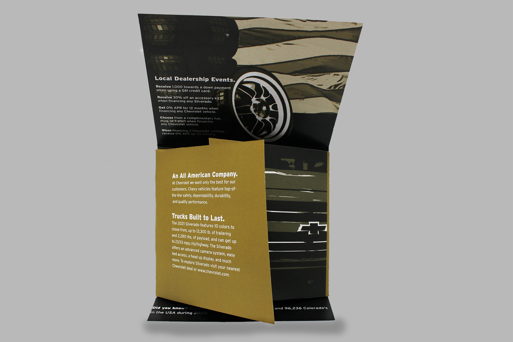
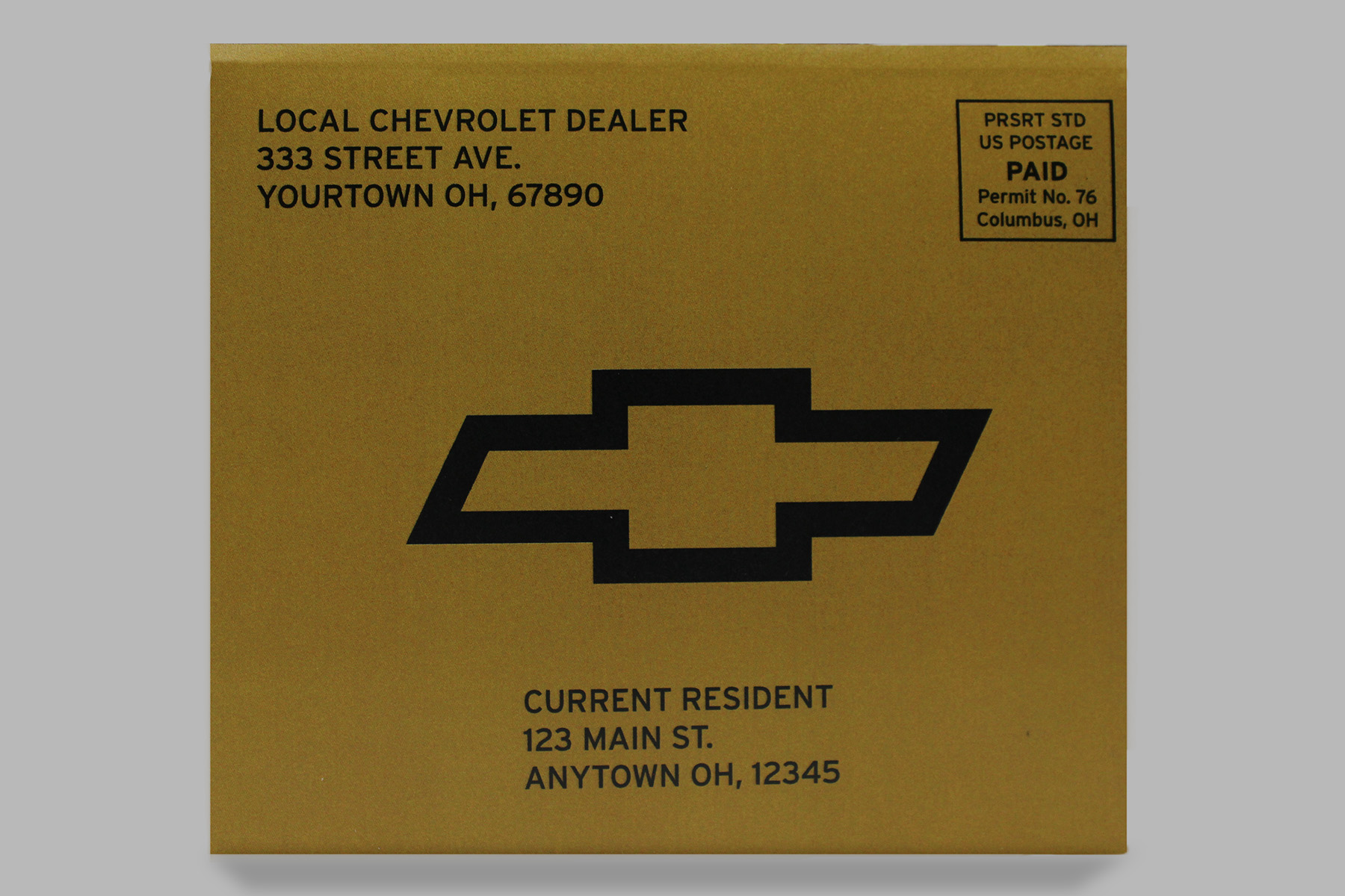
Chevrolet Self Mailer
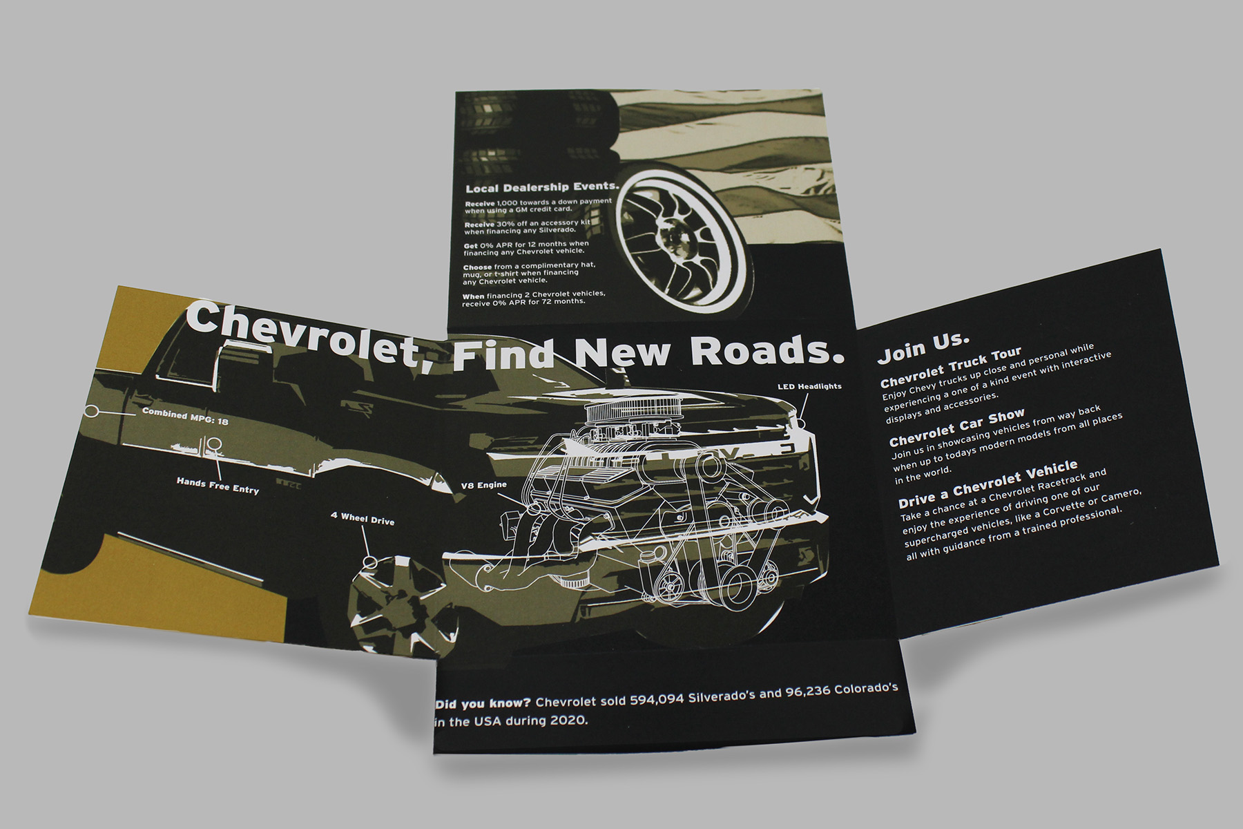
Self-Mailer | Chevrolet Silverado
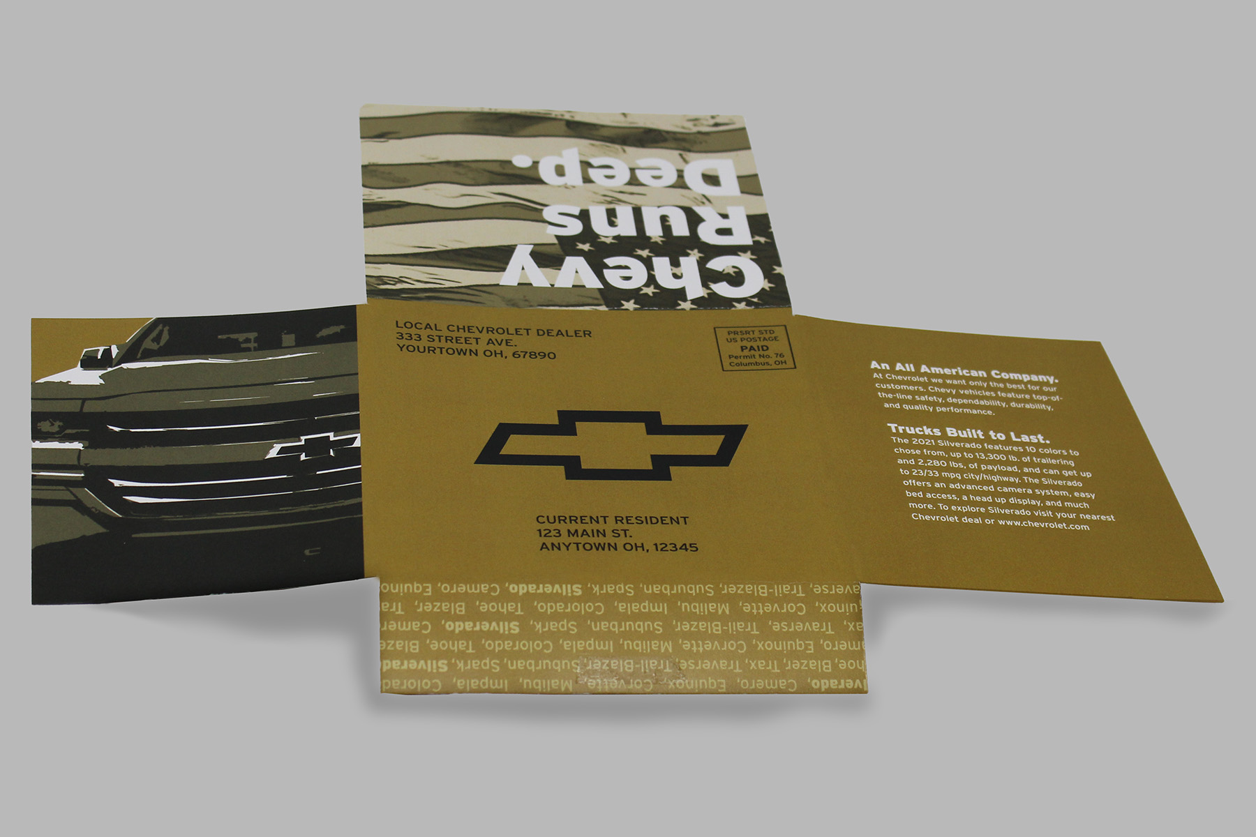
Project: Chevrolet Self-Mailer
Class: Type IV
Professor: Brittyn Dewerth
Date: Spring 2021
Deliverables:
Class: Type IV
Professor: Brittyn Dewerth
Date: Spring 2021
Deliverables:
- A 2 PMS-Self Mailer
Description: This self-mailer uses classic Chevy colors and images to promote sales of the Chevrolet Silverado. The design creates a response from viewers of pride and need for a well-made American vehicle. The design comes across as minimalist and traditionally masculine.
Noodle Head Pasta Boxes
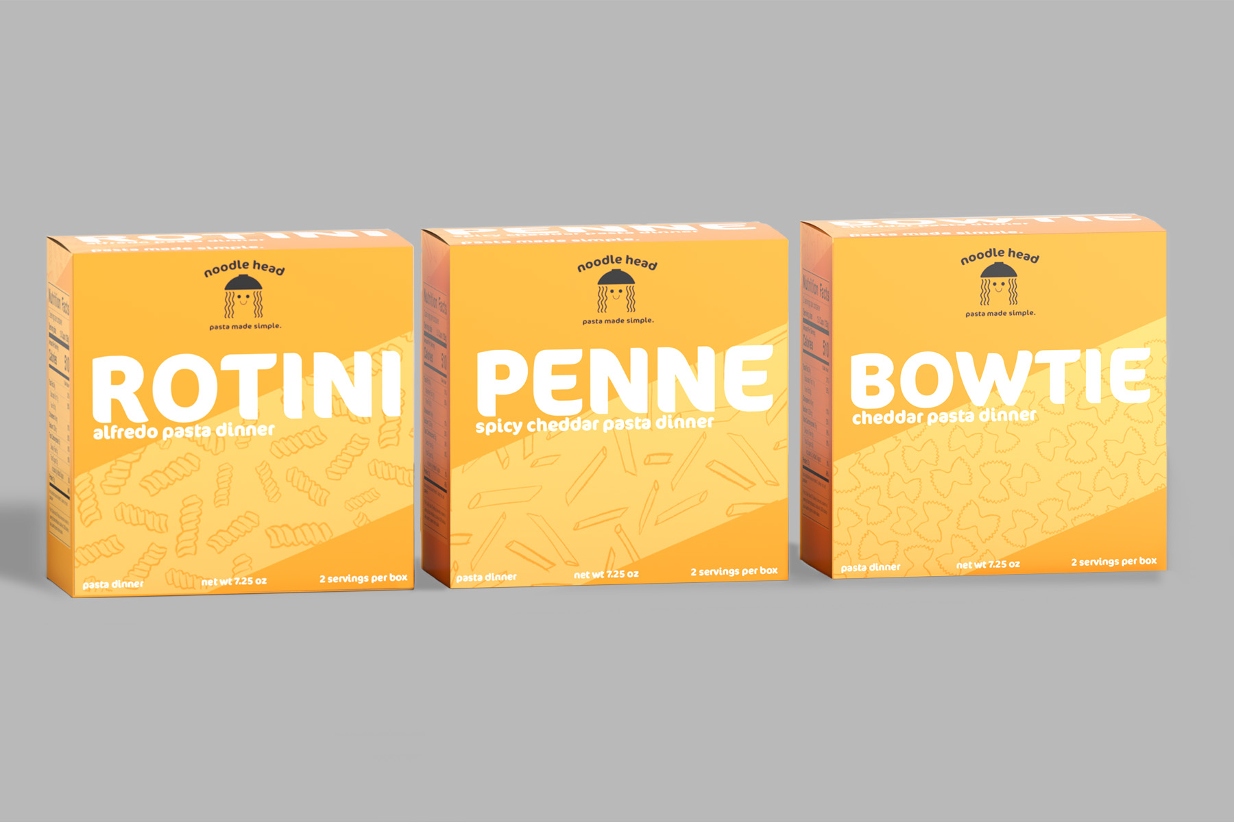
Pasta Box Redesign | Noodle Head Pasta
Project: Pasta Box Redesign
Class: Packaging
Professor: John Morrison
Date: Fall 2021
Deliverables:
Class: Packaging
Professor: John Morrison
Date: Fall 2021
Deliverables:
- 3 fully designed pasta boxes with variation
- Mock up photos
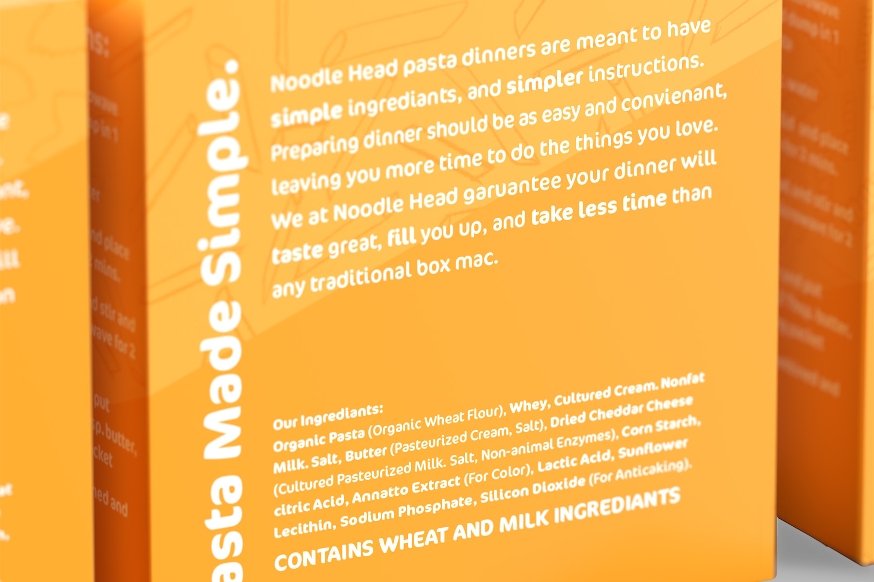
Description: Noodle Head pasta is a playful brand aimed at 18-25 year old customers. The brand is looking to create an affordable, nutritious pasta for younger adults to dive into cooking. By using a playful approach with bold colors and fun illustrations Noodle Head is more approachable to younger people.


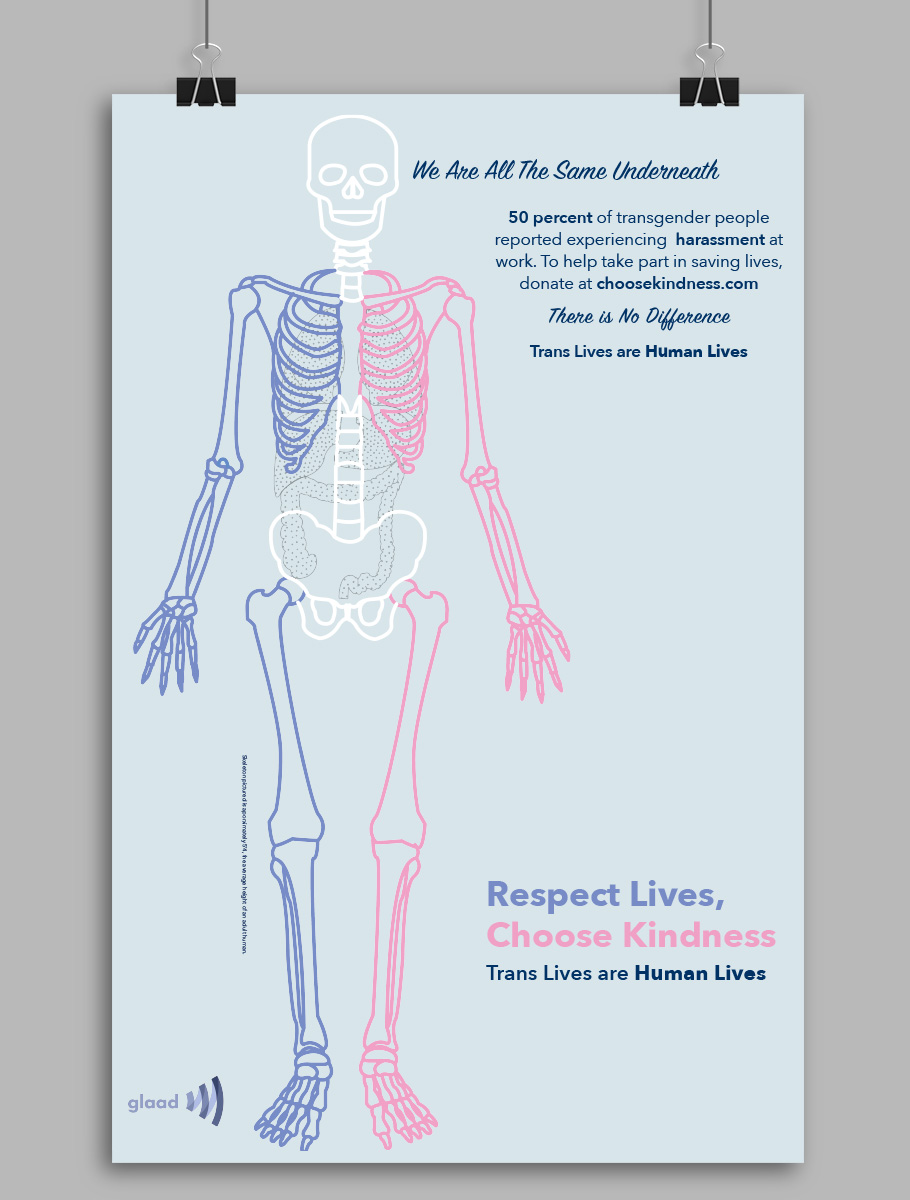
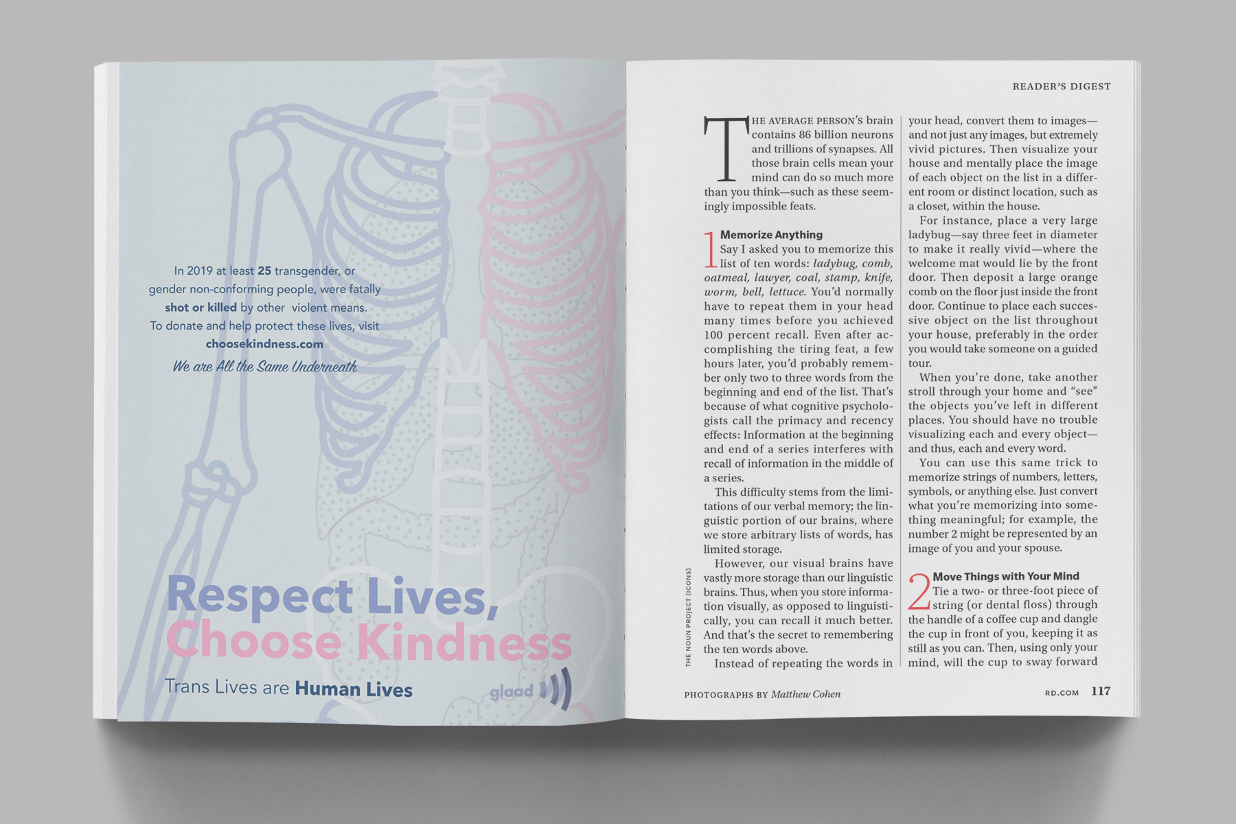
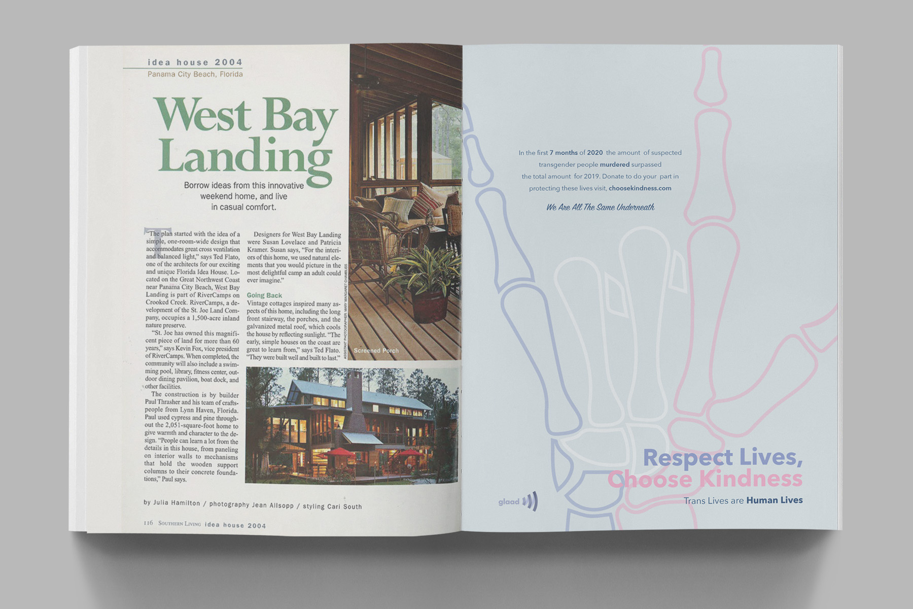
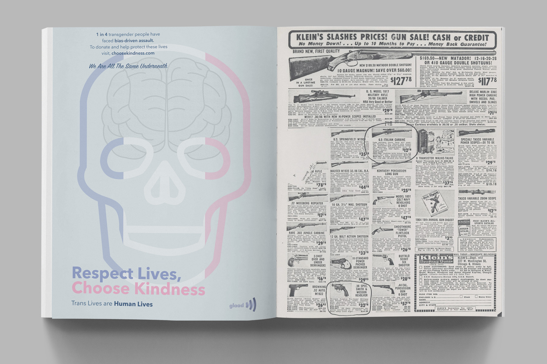
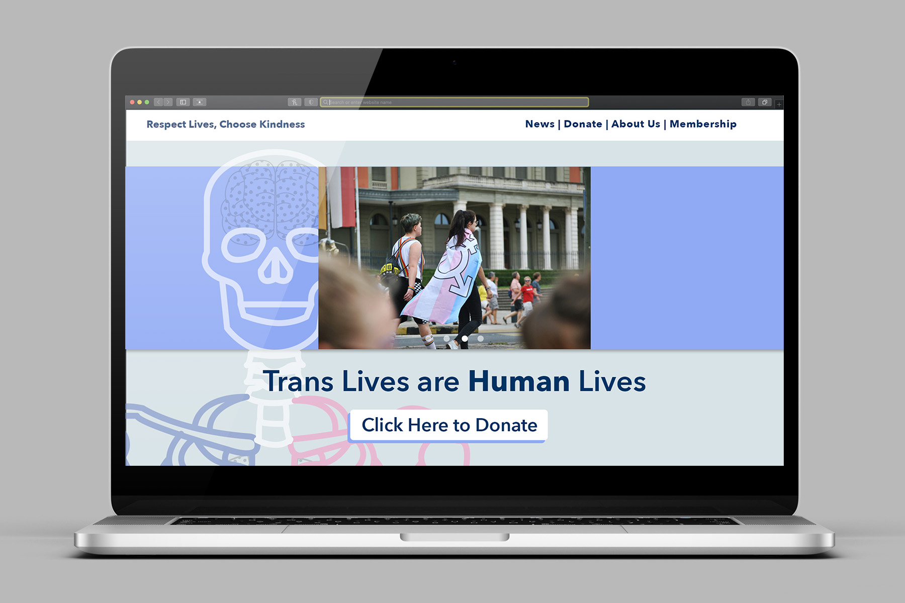
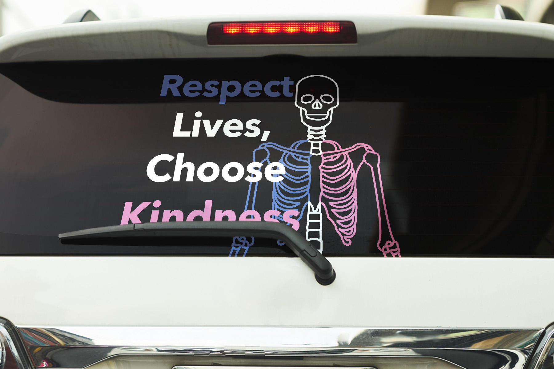
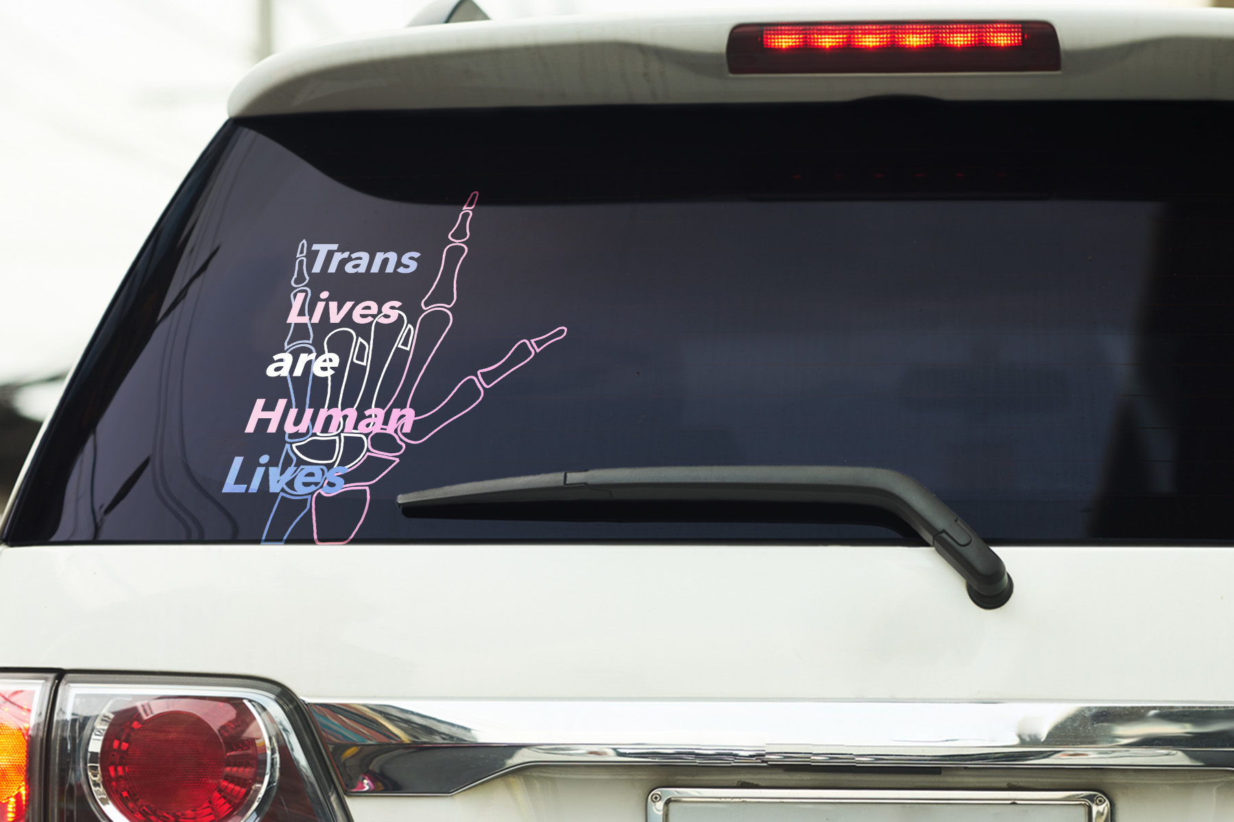
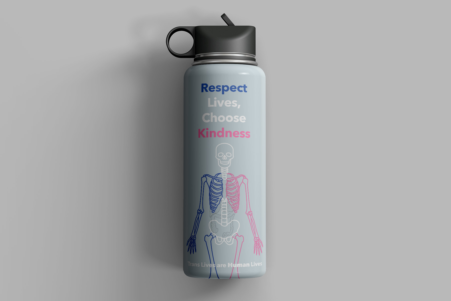
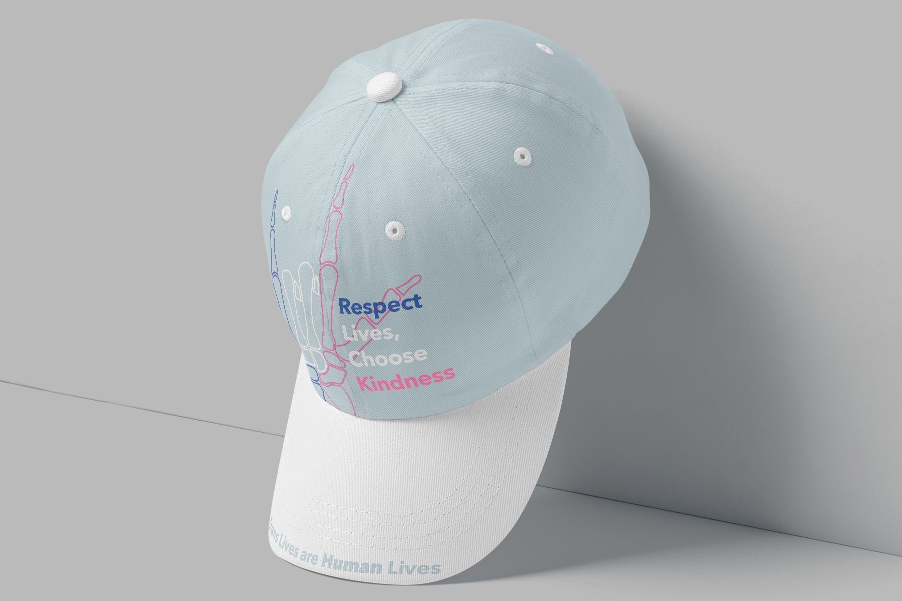
GLAAD Campaign
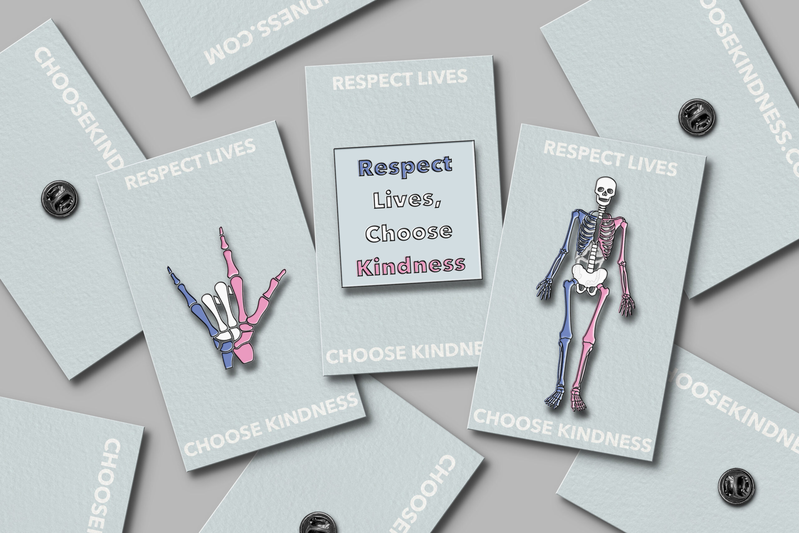
GLAAD Campaign | Transgender Rights
Project: GLAAD Campaign
Class: Typography III
Professor: Brittyn Dewerth
Date: Fall 2020
Deliverables:
Class: Typography III
Professor: Brittyn Dewerth
Date: Fall 2020
Deliverables:
- Poster
- 3 Full Page Magazine Ads
- Website Landing Page
- Public Transportation Application
- 1 Item of Choice
Description: This campaign uses a limited color palette of colors from the transgender flag and illustrations of the skeleton to portray the message of “Respect Lives, Choose Kindness.” Using factual information to educate the public of the discrimination and struggles transgender people face everyday.
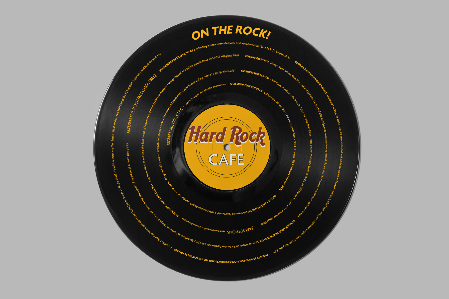
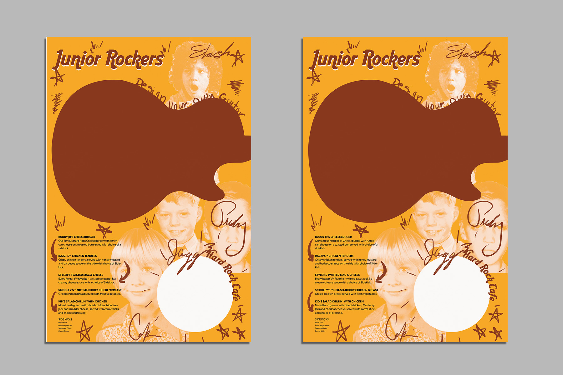
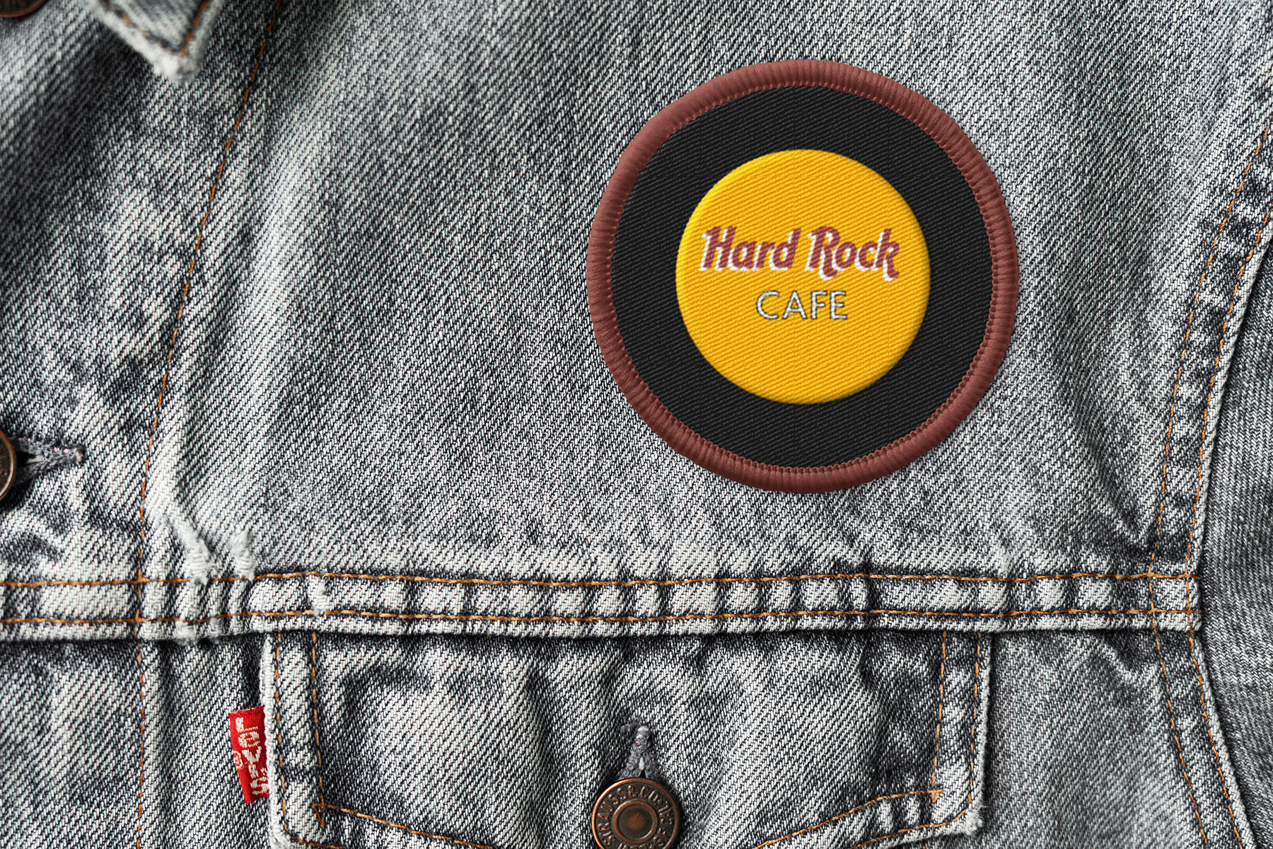
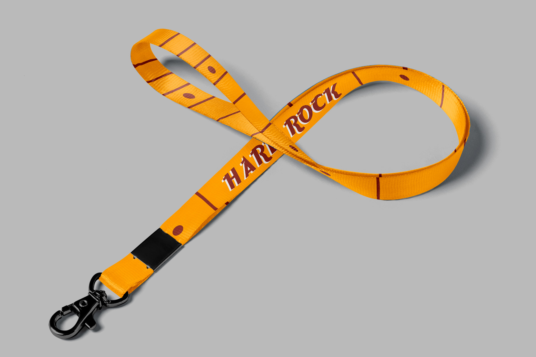
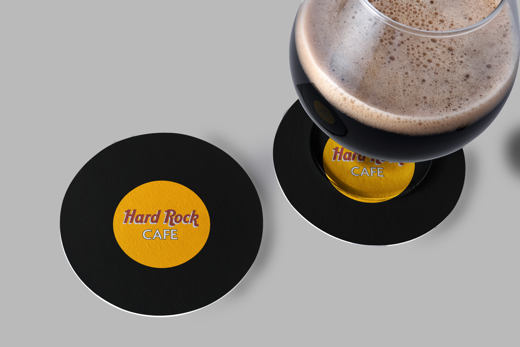
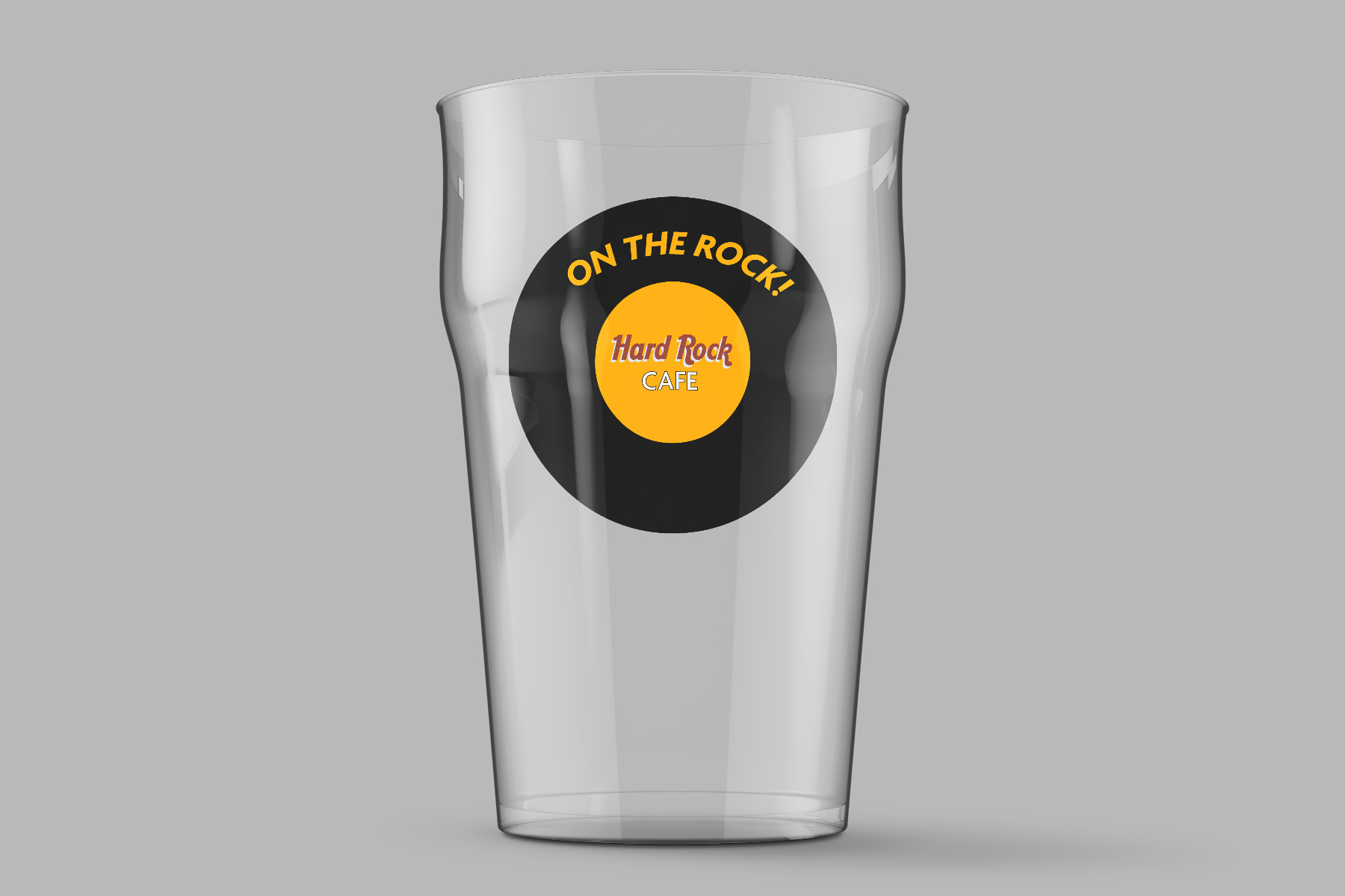
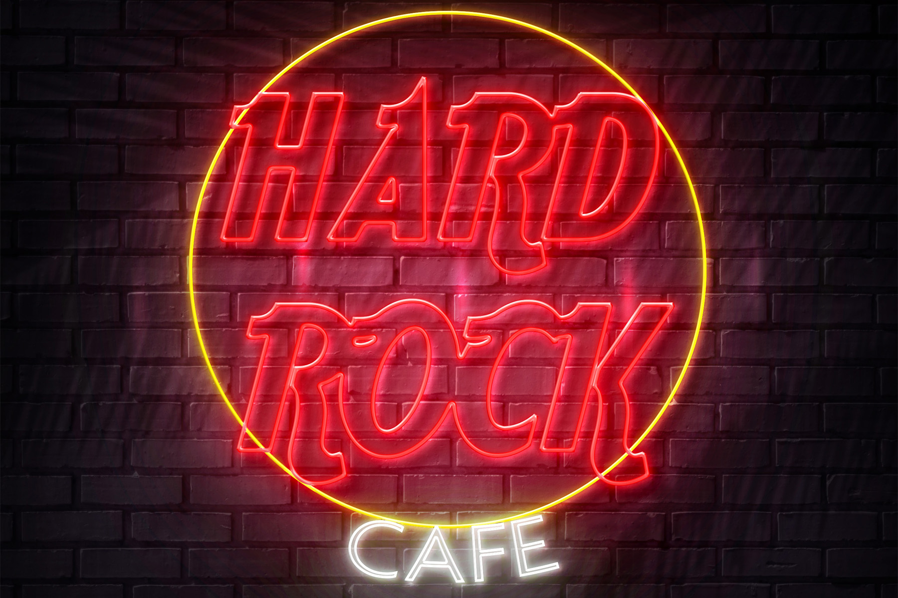
Hard Rock Cafe
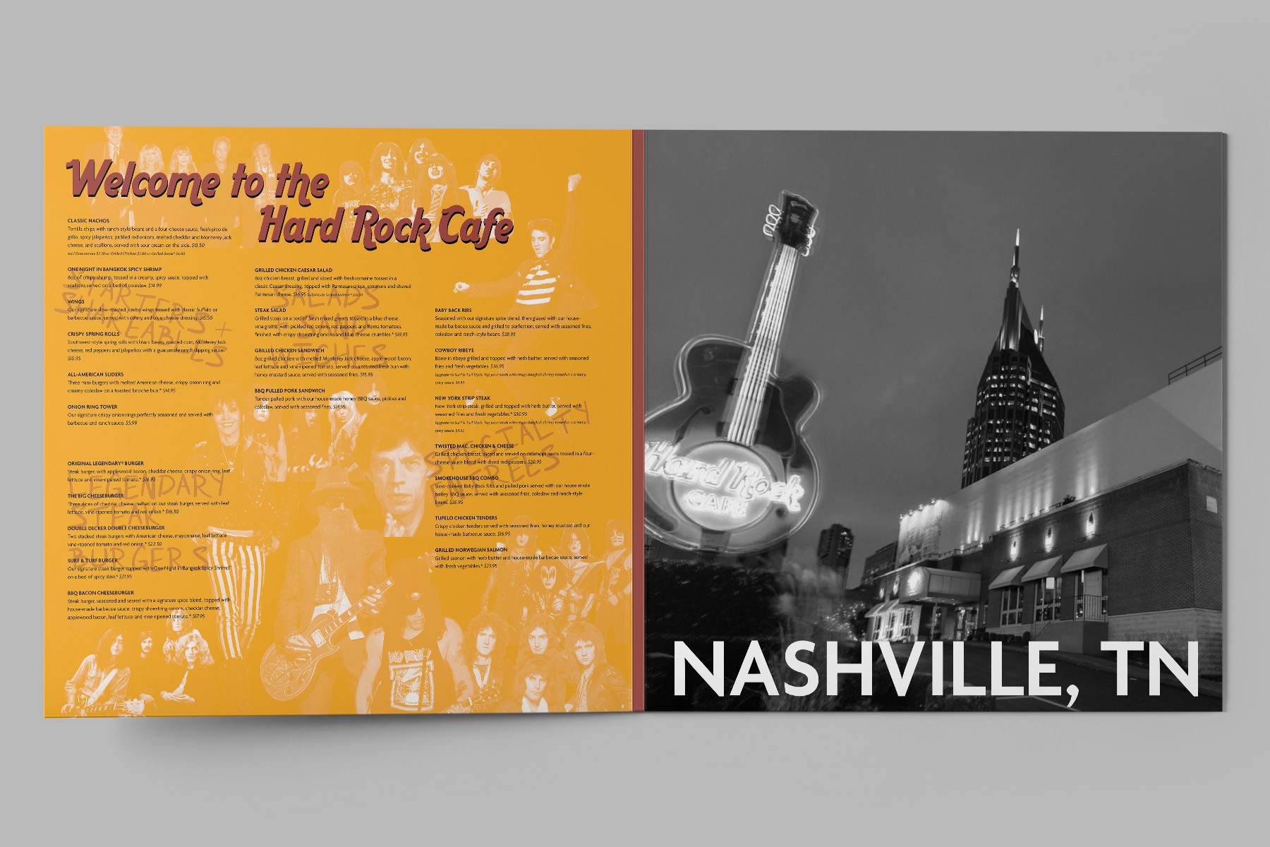
Menu Redesign by Chance | Hard Rock Cafe
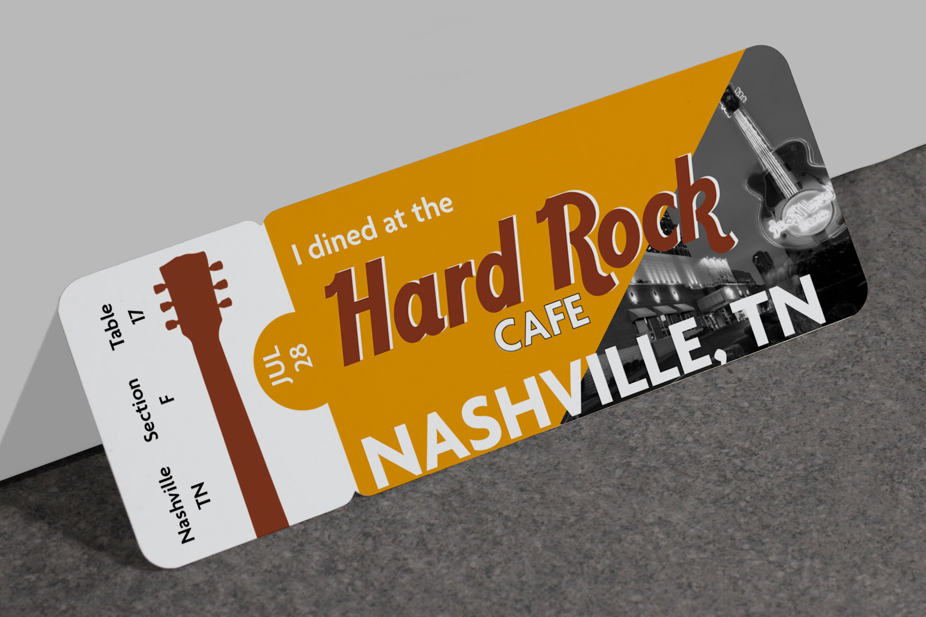
Project: Menu Redesign by Chance
Class: Type IV
Professor: Brittyn Dewerth
Date: Spring 2021
Class: Type IV
Professor: Brittyn Dewerth
Date: Spring 2021
Deliverables:
- Full Menu Design
- 3 Support Items
Design by Chance Parameters:
- A Cafe
- 3 PMS Colors
- Incorporating a Die Cut
- Large-scale Application
Description: Using only 3 PMS colors to create a rock and roll feel, and using typography that pairs well and has vintage character.
Dunlop Guitar Pick Packaging
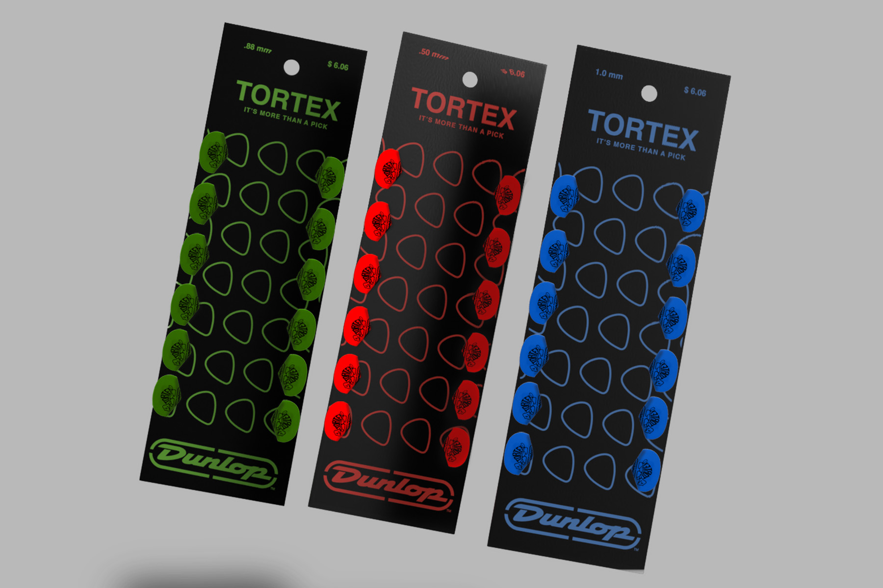
Minimalist Packaging | Dunlop Guitar Picks
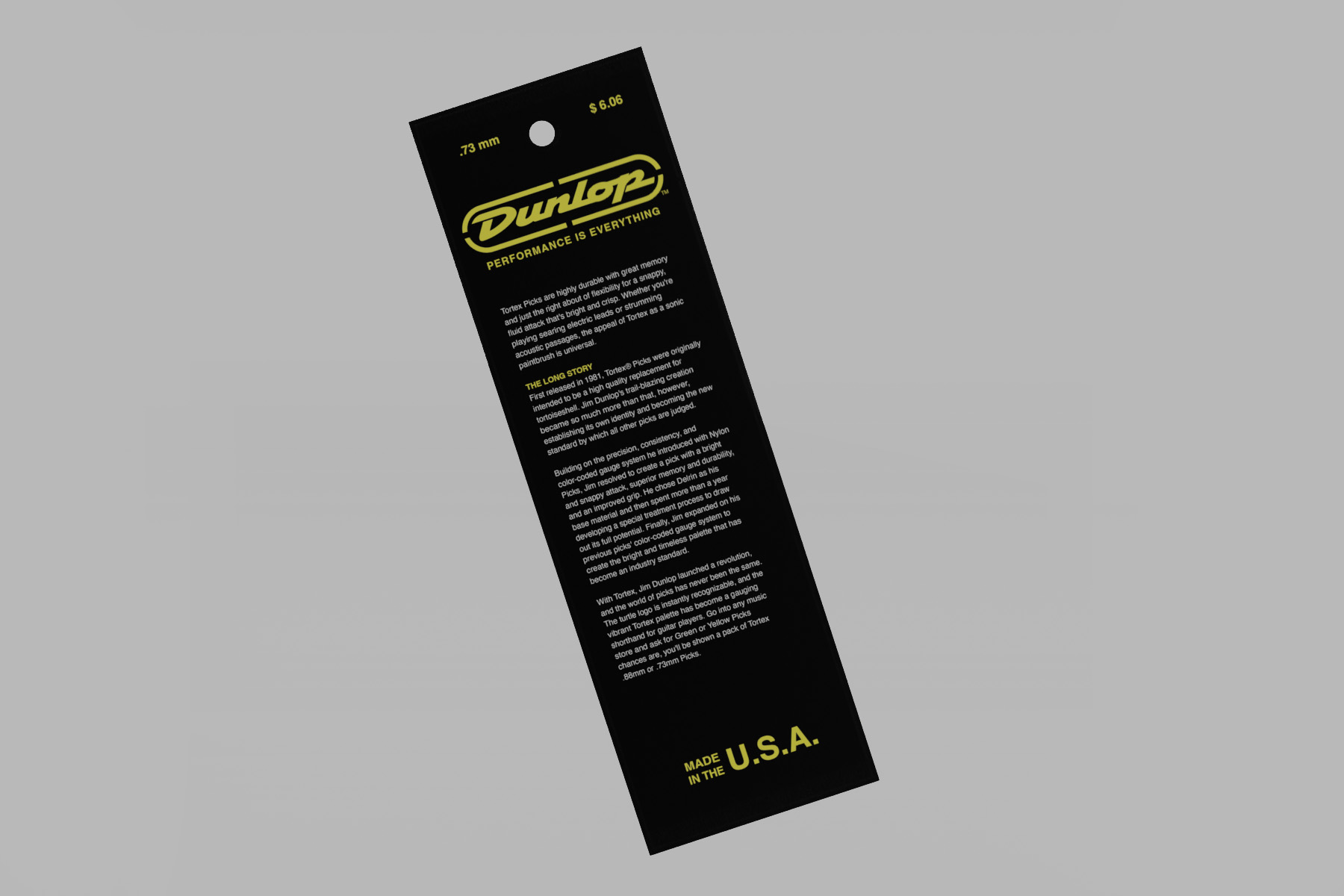
Project: Minimalist & Eco-Friendly Packaging
Class: Packaging Design
Professor: John Morrison
Date: Fall 2021
Deliverables:
Class: Packaging Design
Professor: John Morrison
Date: Fall 2021
Deliverables:
- Unique Packaging Form
- Color Compositions of Forms (mock ups)
Description: Dunlop guitar picks are widely recognizable by the bright rainbow colors. This packaging form takes the plastic and waste out, being made from just cardboard makes it completely recycleable. It is also easy to pick out hanging on shelves.
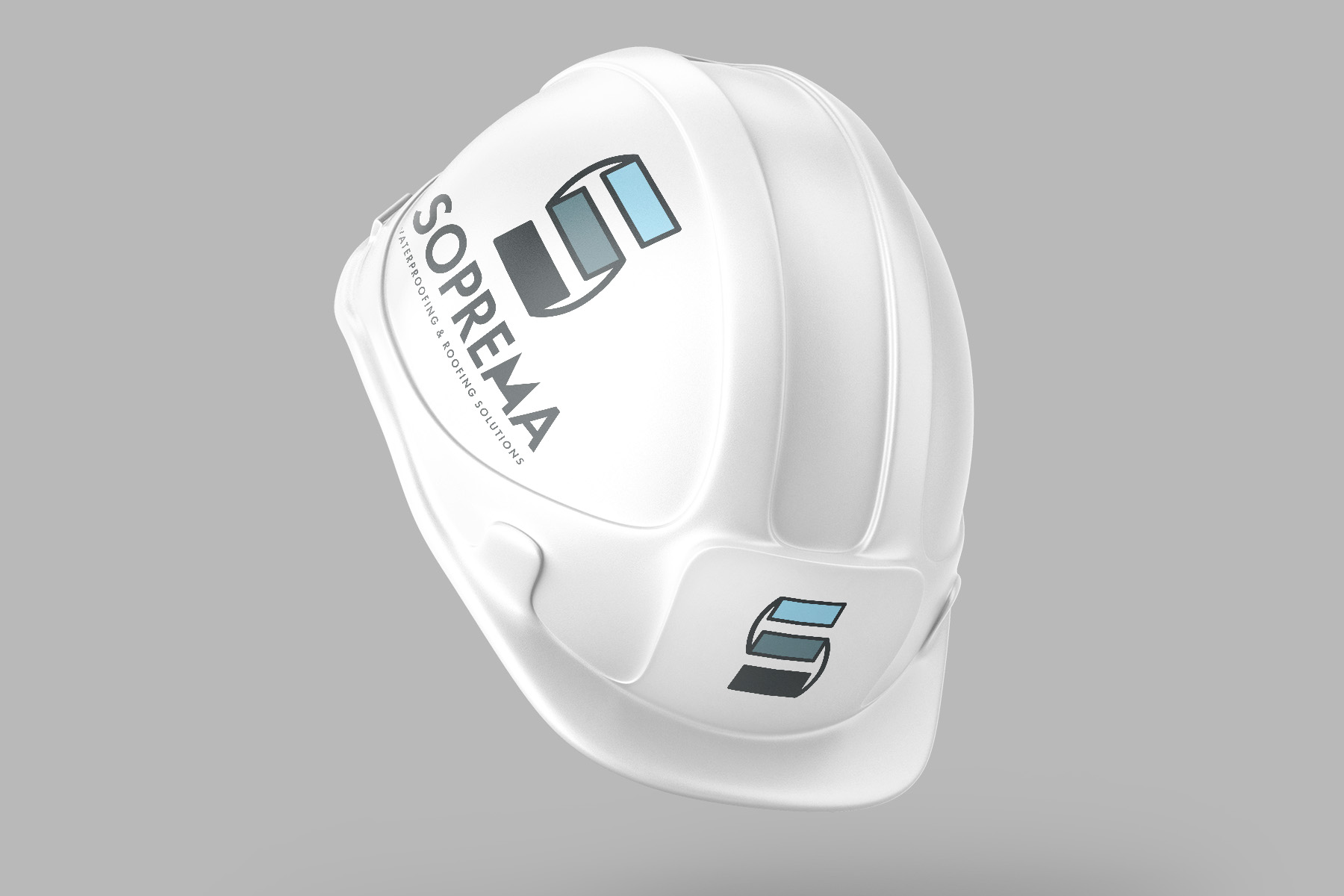
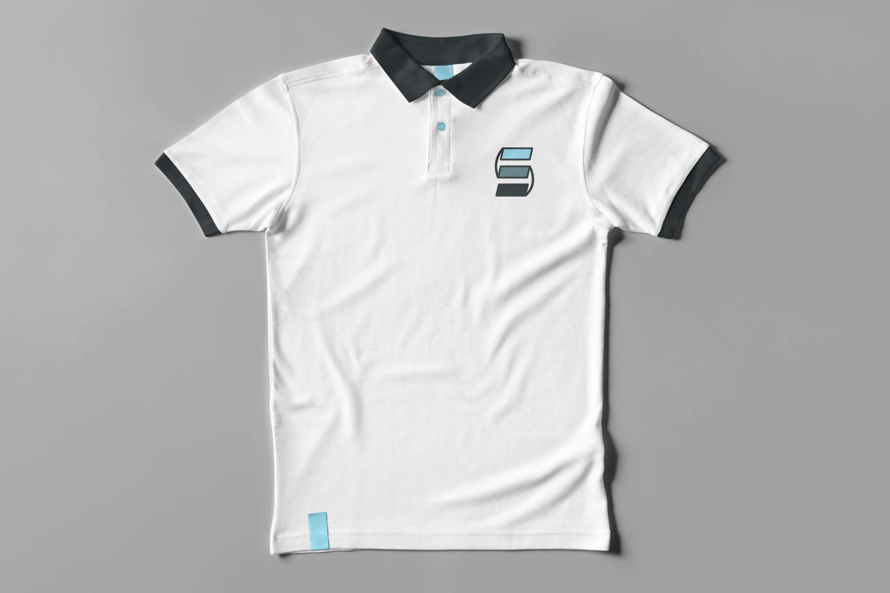
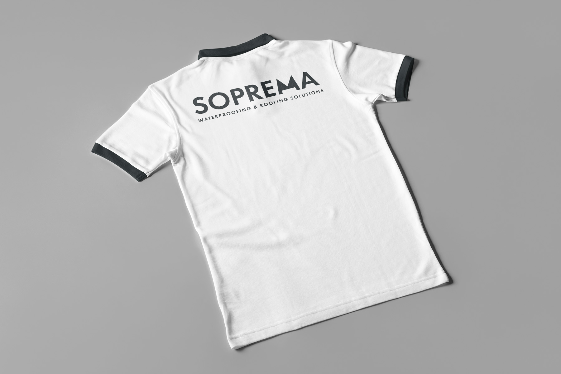
Soprema Rebrand
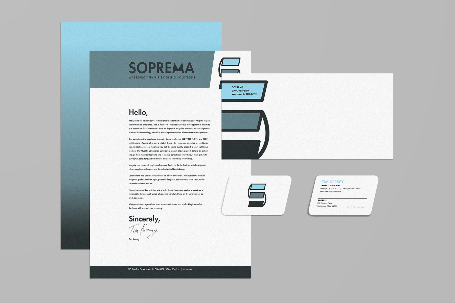
Brand Identity | Soprema Roofing and Waterproofing
Project: Soprema Brand Identity
Class: Corporate ID
Professor: Brittyn Dewerth
Date: Fall 2021
Deliverables:
Class: Corporate ID
Professor: Brittyn Dewerth
Date: Fall 2021
Deliverables:
- Redesigned Logo
- Envelope Design
- Business Card Design
- Letterhead Design
Description: The new Soprema logo uses blues to reflect water, as they are a waterproofing company. The segments of the S are meant to reflect shingles because Soprema is also a roofing company. The stationary build out reflects the new brand, mimicking the angles and colors.
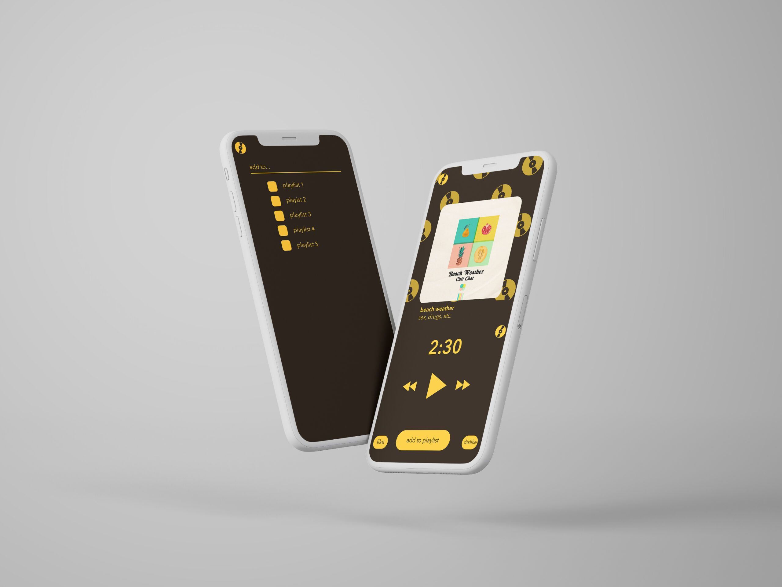
Althentic
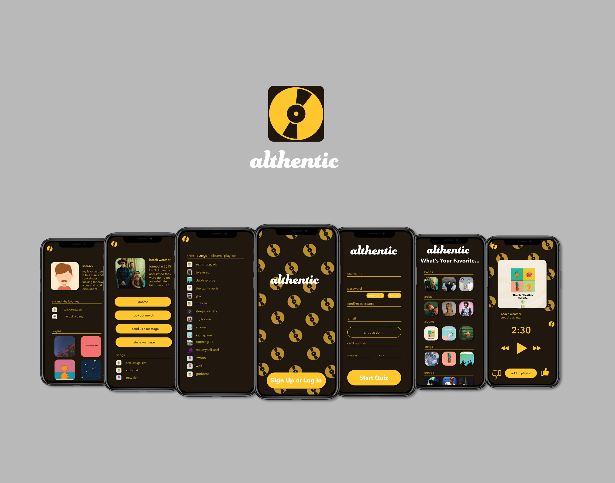
App Design | Althentic Music Listening App
Project: App Design
Class: UI/UX Design
Professor: Anthony Samangy
Date: Spring 2021
Deliverables:
Class: UI/UX Design
Professor: Anthony Samangy
Date: Spring 2021
Deliverables:
- Fully Designed Application
- Invision Prototype
- Presentation Sample
Description: Althentic focuses on giving users a way to avoid mainstream music and having a completely custom session every time. Users will have personalized playlist, and be able to create playlist. Discovering new music and artist will be easier than ever, plus listeners will be able to interact with artist and purchase merchandise through the app.
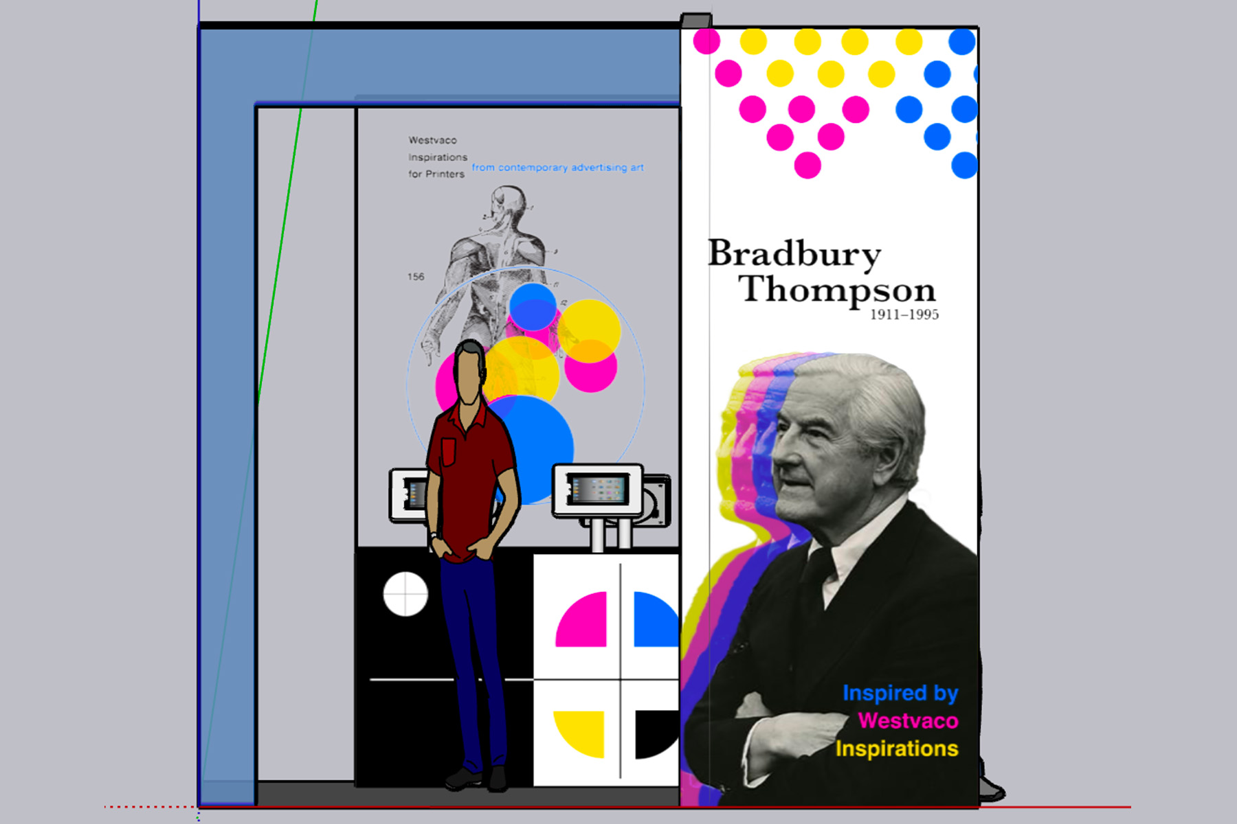
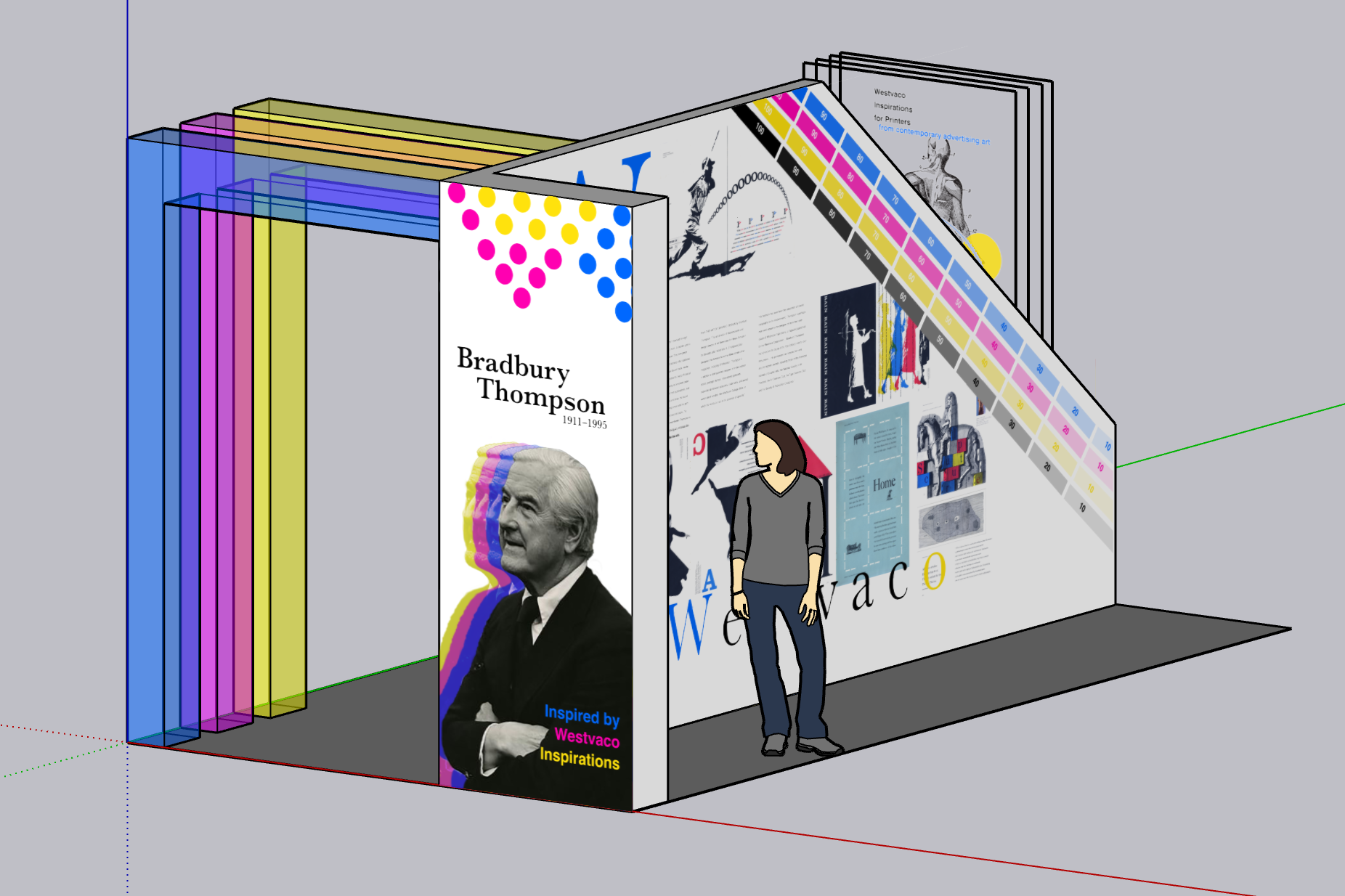
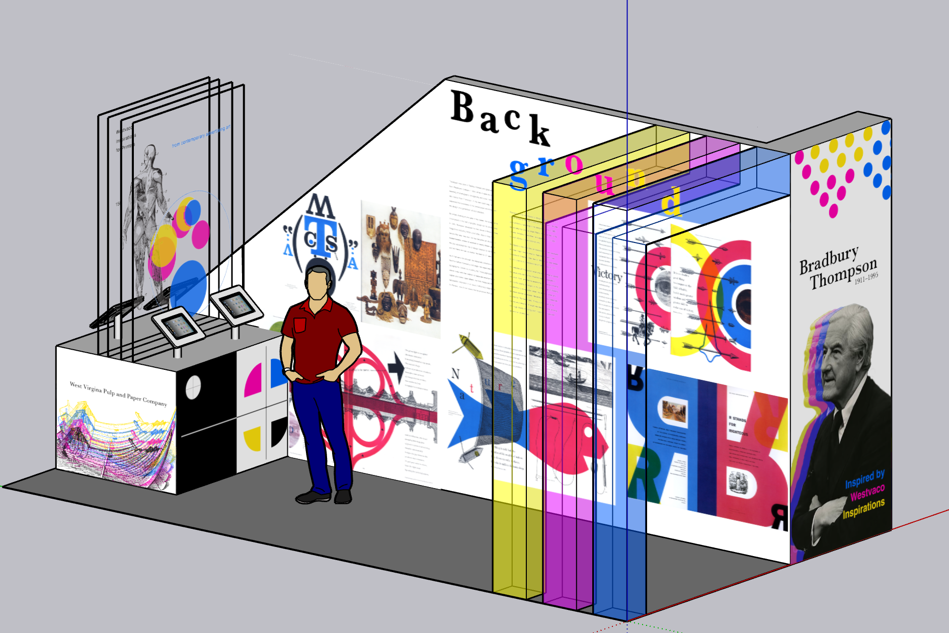
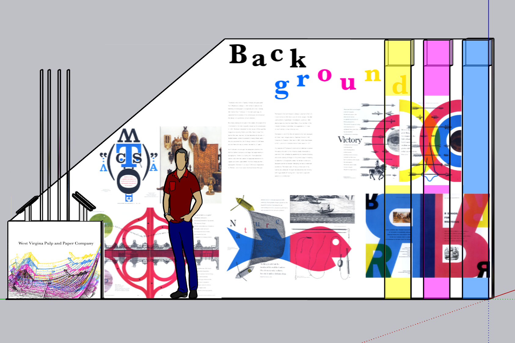
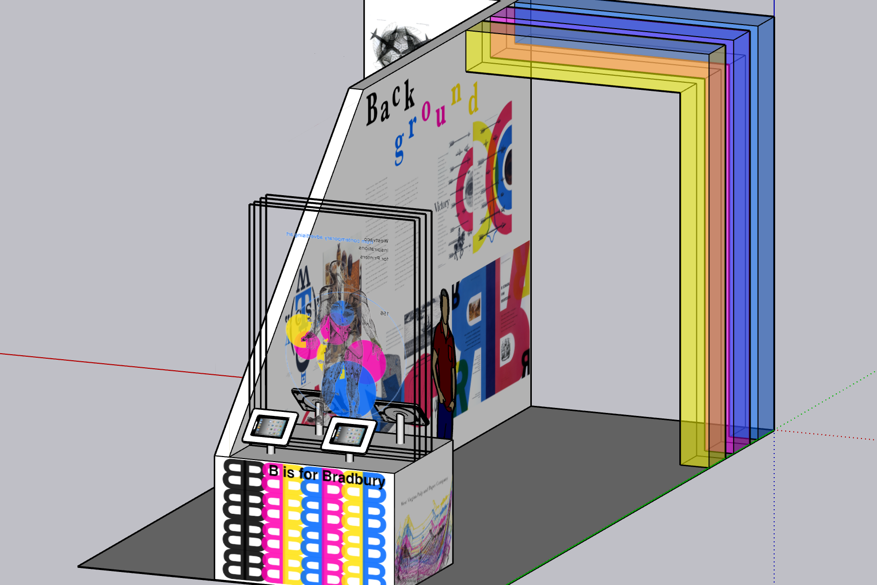
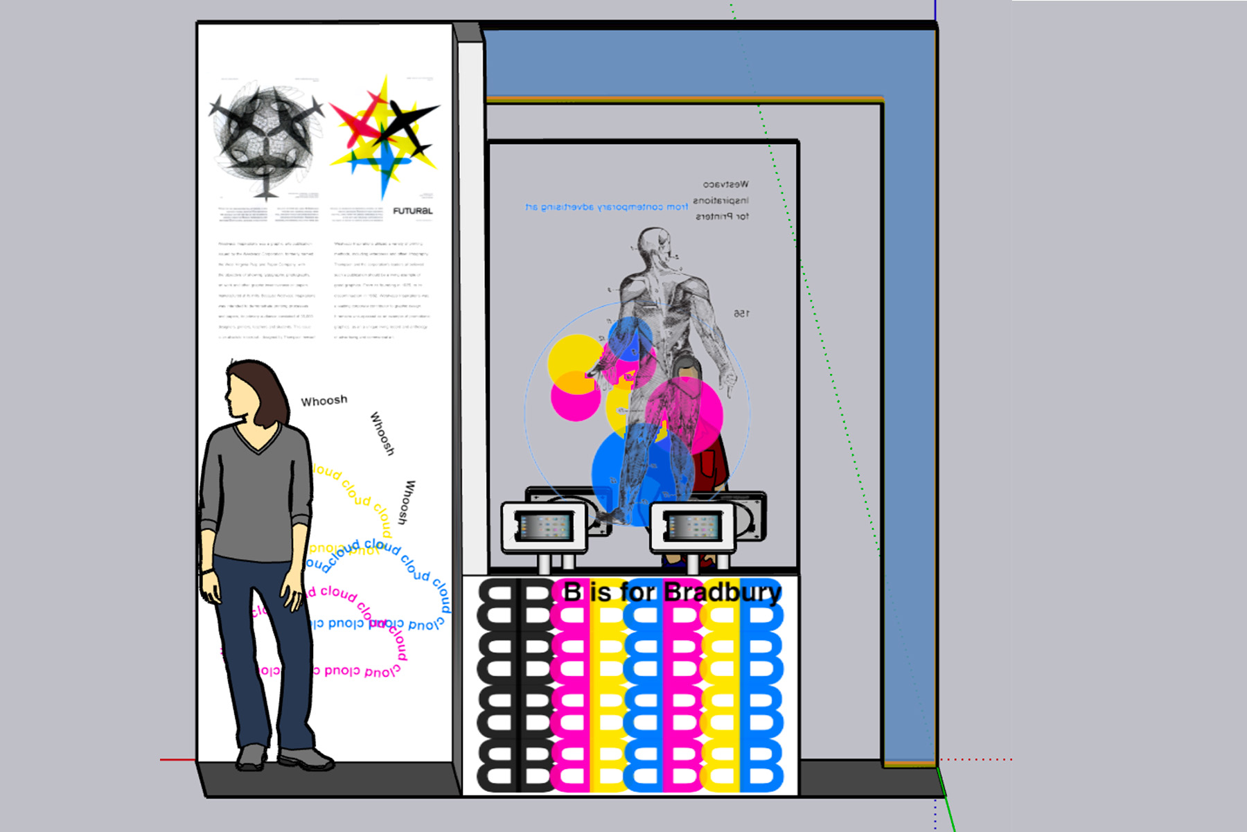
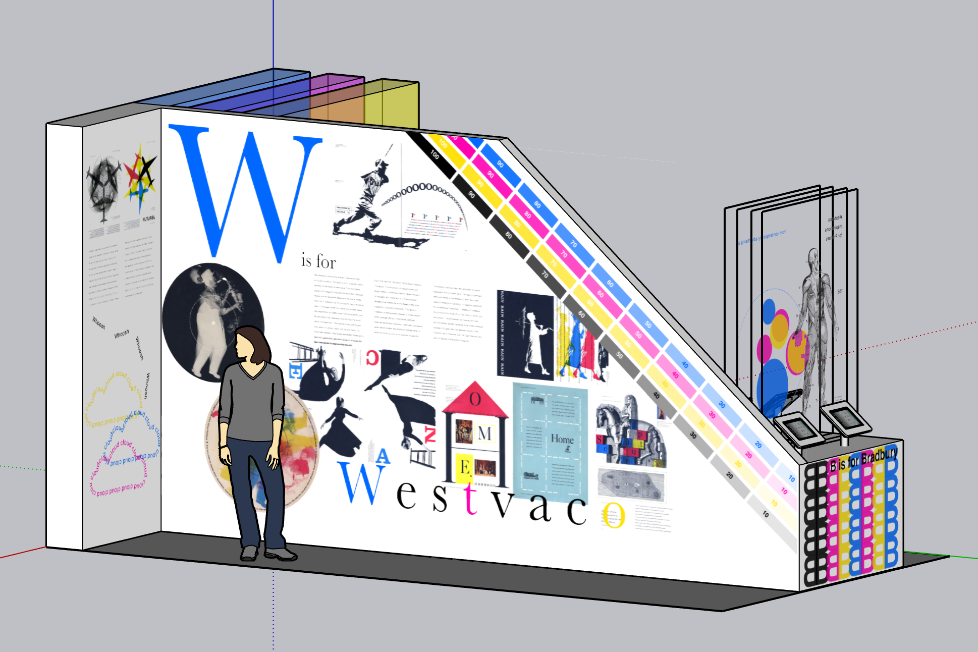
Informational Kiosk
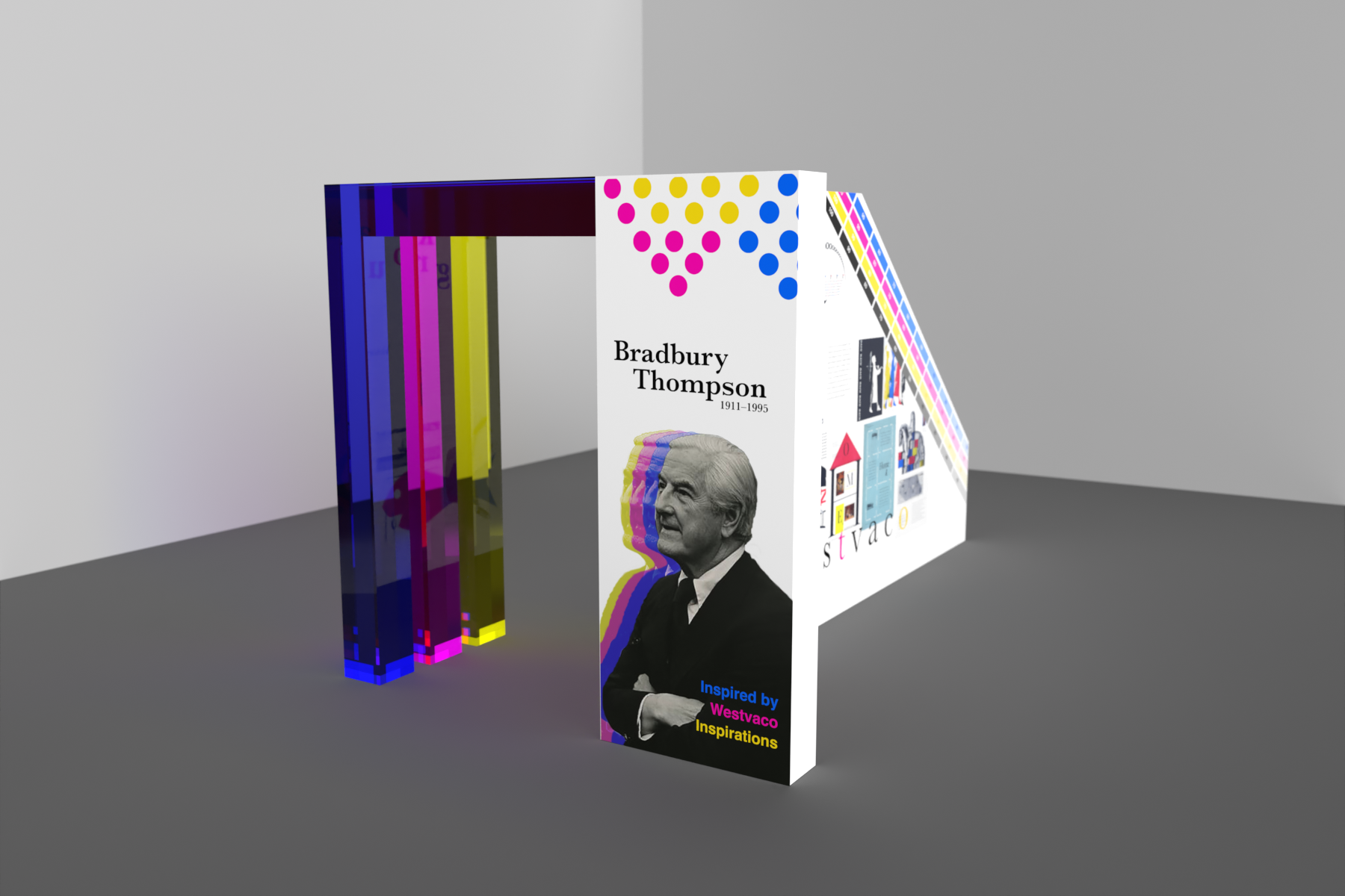
Informational Kiosk | Bradbury Thompson
Project: Informational Kiosk
Class: Advanced Graphic Design
Professor: Bob Kelemen
Date: Spring 2022
Deliverables:
Class: Advanced Graphic Design
Professor: Bob Kelemen
Date: Spring 2022
Deliverables:
- Original Kiosk Form
- Flat Design of Kiosk Surfaces
- 3D Rendering of Kiosk
- Elevation Views of Kiosk
Description: The focus of this kiosk was typography: how it interacts with type and the layout and grid structure of the kiosk. The design is inspired by Thompson by using whitespace and CMYK. The kiosk focuses on his work in Westvaco and showcases this with information on Thompson and Westvaco.
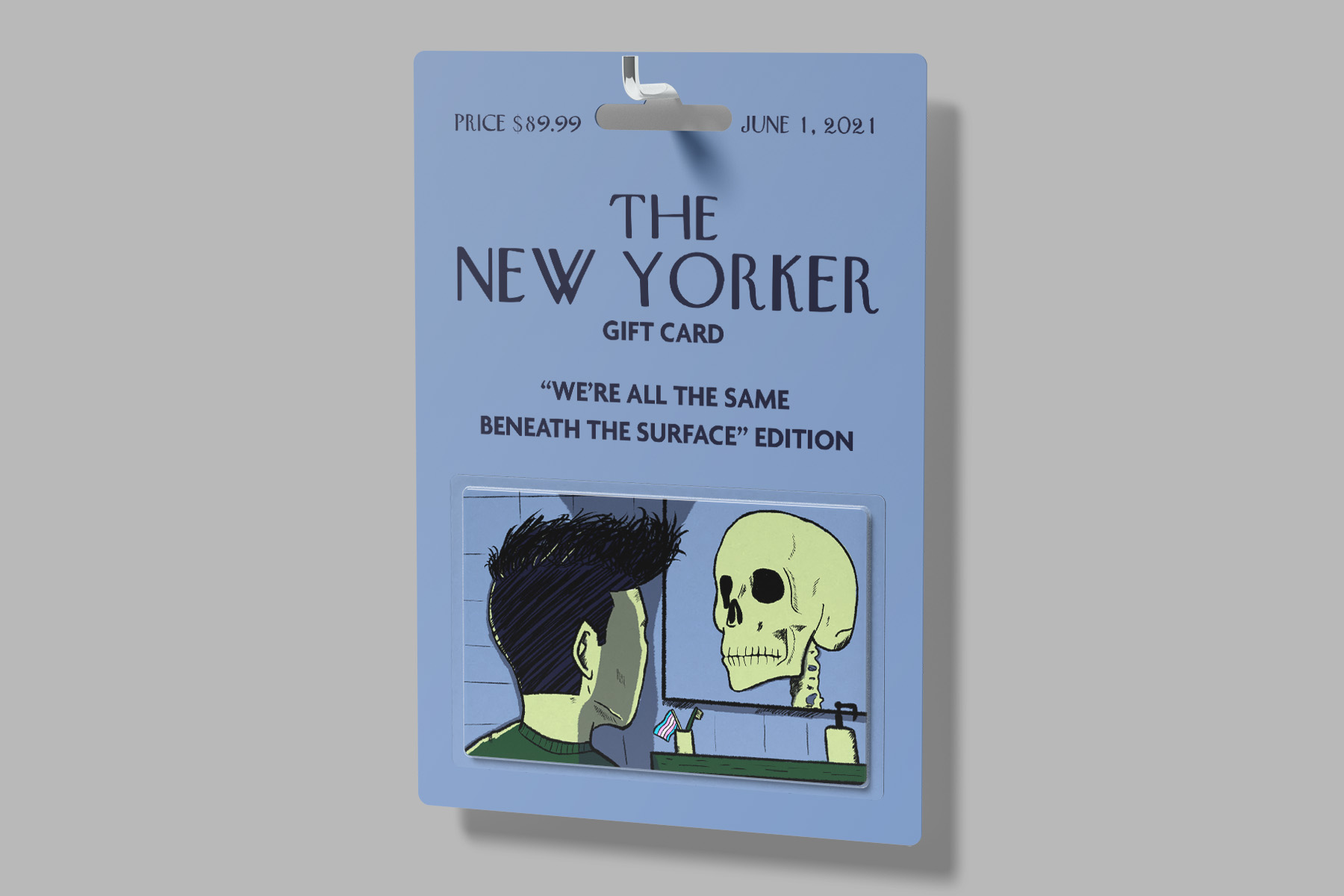
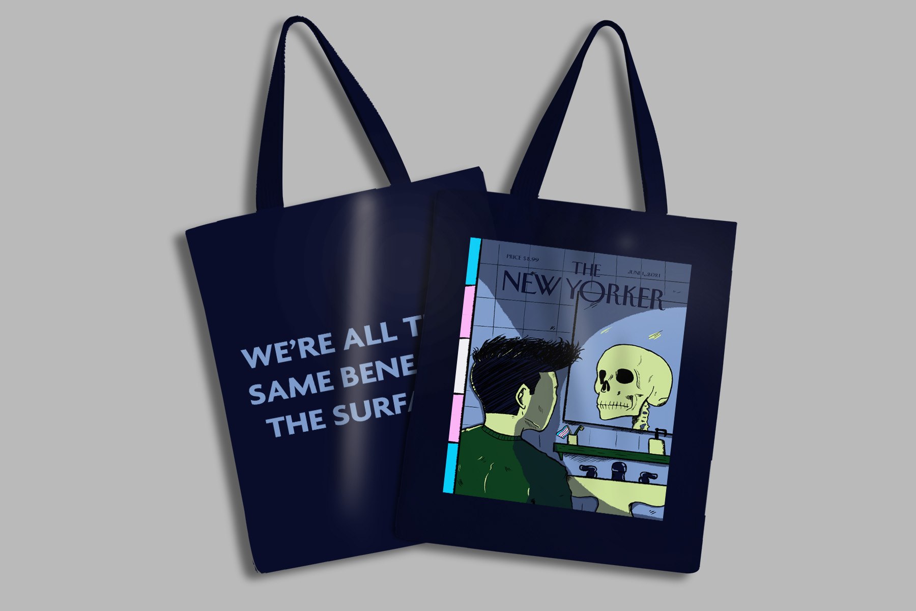
New Yorker Cover
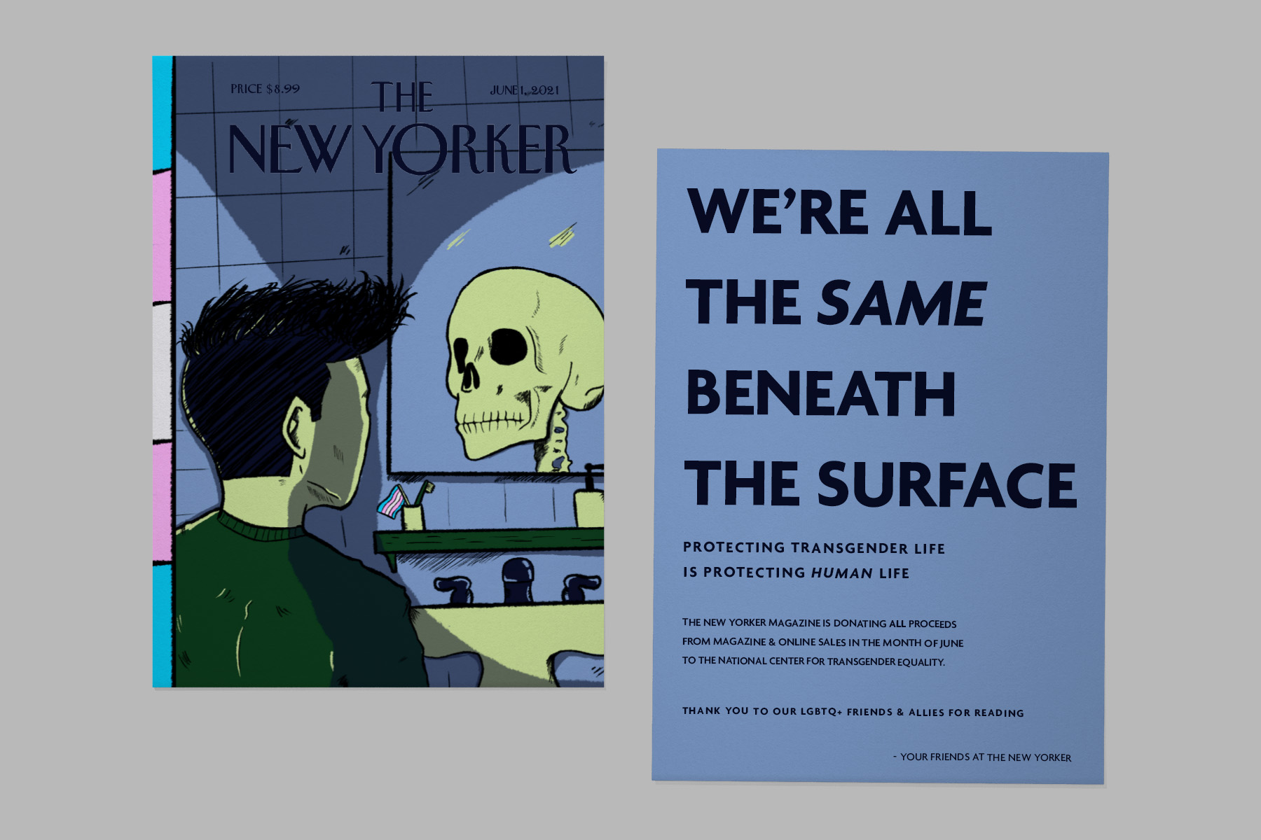
New Yorker Illustration | We’re All The Same Beneath the Surface

Project: New Yorker Cover Illustration
Class: Illustration
Professor: Kristina Gauer
Date: Fall 2021
Deliverables:
Class: Illustration
Professor: Kristina Gauer
Date: Fall 2021
Deliverables:
- 7 7/8 x 10 3/4 300 DPI Image
- Animated Gif Version
Description: Individuals who are transgender struggle with discrimination and hate every day throughout the world. This illustration speaks on how everyone is the same underneath; we are all human, flesh and bones. Using a limited color palette and purposeful lighting creates the feeling of dismality. This is meant to make people think of what it may be like to be pursuing your true identity and to be discriminated against for it; hoping one day everyone will realize we are all the same beneath the surface.
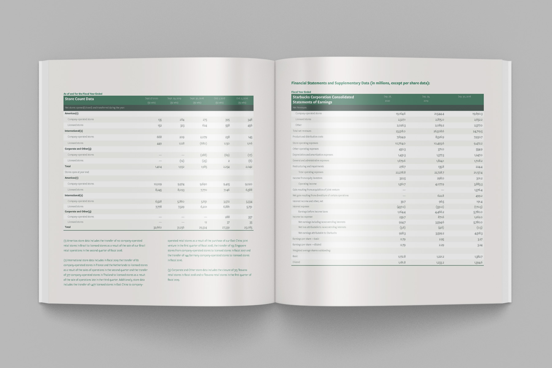
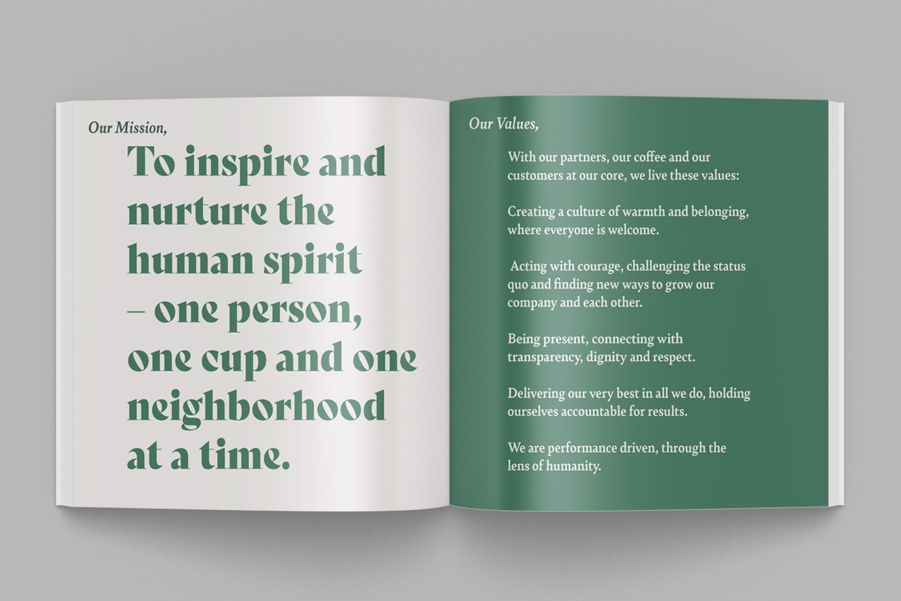
Starbucks Annual Report
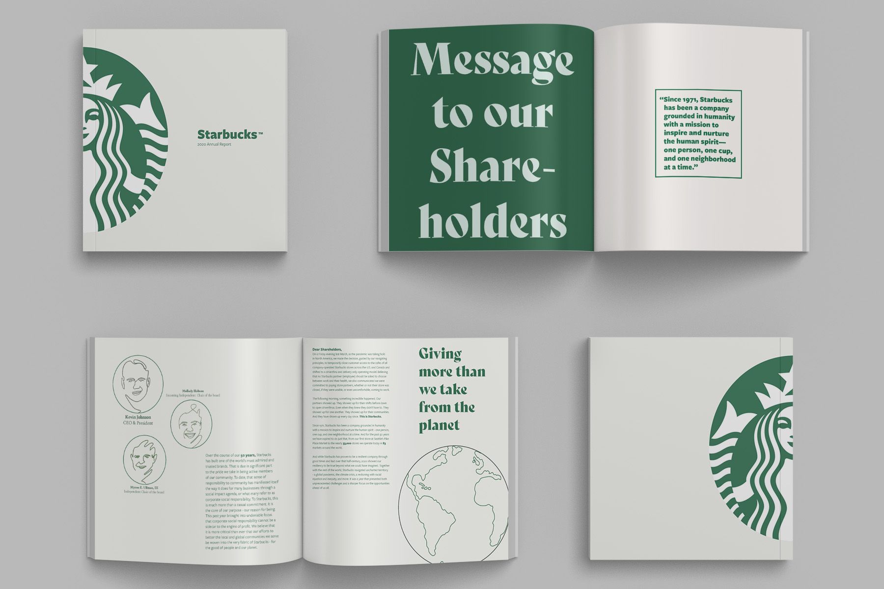
Annual Report | Starbucks
Project: Starbucks Annual Report
Class: Typography IV
Professor: Brittyn Dewerth
Date: Spring 2021
Deliverables:
Class: Typography IV
Professor: Brittyn Dewerth
Date: Spring 2021
Deliverables:
- Multiple Spreads of Unique Content
- Spreads Set into Mock Up Photos
Description: An annual report that reflects the Starbucks brand by using similar font, brand colors, and illustration.